Improving Ecommerce Conversion Rates with Proven Tactics
If you want to boost your ecommerce conversion rates, the first step is to get a clear, honest look at where you stand right now. Forget about chasing some magic, universal number. The real secret is in understanding your own data, figuring out where you’re losing people, and making small, smart changes that add up.
How to Start Improving Your Ecommerce Conversions
Before you can fix anything, you have to diagnose the problem. A lot of store owners get hung up on what a "good" conversion rate is, but that's often a distraction. What's good for a cosmetics brand is going to be completely different from a store selling high-end furniture.
As of 2025, the average ecommerce conversion rate sits somewhere between 2% and 4% globally. But that's just an average. Dig a little deeper, and you'll see a huge variance. For example, personal care brands often hit around 6.8% because they sell items people buy repeatedly. On the flip side, industries with bigger price tags, like home decor, average closer to 1.4%, and fashion and jewelry are usually around 1.9%.
This infographic really drives home just how much conversion rates can differ from one industry to another.
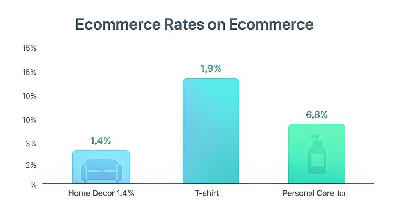
It's clear that comparing a skincare store to a furniture shop is like comparing apples and oranges. You need to benchmark against your own industry to get a realistic picture.
Ecommerce Conversion Rate Benchmarks by Industry
To give you a better idea of where you might stand, here's a quick overview of average conversion rates across different ecommerce sectors. Use this to benchmark your store's performance against your direct competitors, not the entire internet.
| Industry | Average Conversion Rate |
|---|---|
| Personal Care | 6.8% |
| Apparel & Fashion | 1.9% |
| Home Decor & Furnishings | 1.4% |
| Jewelry & Luxury Goods | 1.9% |
| Food & Beverage | 5.5% |
| Electronics | 2.1% |
Remember, these are just starting points. The real work begins when you dive into your own analytics to see what's happening on your site.
Finding Your True Performance Baseline
Okay, it's time to move past the averages and figure out your store's unique baseline. This means rolling up your sleeves and getting into your analytics to see the story your data is telling. Don't just glance at the overall conversion rate; you need to slice and dice that data to find the good stuff.
Your goal isn't to hit an arbitrary number. It’s to achieve consistent, incremental growth from where you are today. This data-first mindset ensures you're putting effort into changes that actually make a difference for your business.
Fire up a tool like Google Analytics and start looking at a few key metrics:
- Conversion Rate by Traffic Source: Are your paid social ads converting better than your organic search traffic? This tells you where your best customers are coming from.
- Conversion Rate by Device: It’s common to see tons of traffic from mobile but way more conversions from desktop. A massive gap here is a huge sign that your mobile experience needs some serious attention.
- Add to Cart Rate: This is a great indicator of interest. If people are adding items to their cart but not checking out, the problem isn't your products—it's your checkout flow.
- Cart Abandonment Rate: A high abandonment rate is a classic red flag. It almost always points to surprise shipping costs, a clunky checkout process, or a lack of trust signals like security badges.
By analyzing these numbers, you can pinpoint the exact moments where potential customers are bailing. This is where an AI tool like an MxChat conversion bot can completely transform your website. It can jump in at those critical drop-off points, answer last-minute questions, and gently guide shoppers over the finish line.
Designing a User Experience That Sells
A clunky or slow website is a guaranteed way to kill a sale. When you want to boost your conversion rates, the best place to start is by walking a mile in your customer's shoes. The goal is to design an experience that feels simple, trustworthy, and completely effortless. It's less about flashy graphics and more about systematically removing friction from the buying journey.
Think about the last time you bailed on a purchase. Was it because you couldn't find the search bar? Or maybe the product photos were so blurry you had no idea what you were actually getting. These small details make or break a shopper's confidence.
Simplify and Streamline Navigation
Modern shoppers have zero patience for confusing menus or getting stuck in a loop of endless clicks. You need to get them from your homepage to the product they want as fast as possible. If they have to stop and think about where to go next, you're already losing them.
- Keep your main menu clean: Don't drown visitors in options. Stick to the most critical categories and organize everything else into logical subcategories.
- Invest in smart search: A good search bar isn't just a box—it has features like autocomplete and typo correction that make finding products a breeze.
- Use breadcrumbs: These little navigation trails show users their path through your site, letting them easily step back without having to start their search all over again.
The best user experiences are the ones you don't even notice. Customers never think, "Wow, what great navigation!" They only notice when it's bad. Make your site easy to browse, and you'll eliminate a huge source of frustration that tanks conversions.
Build Confidence with High-Quality Visuals and Copy
Once a shopper hits a product page, your mission is to answer every question they could possibly have. Since they can't pick up the product, your photos and descriptions have to do all the work. We're talking high-resolution images from every angle, zoom features, and even short videos showing the product in action. These aren't optional anymore; they're essential.
This is also where social proof seals the deal. Authentic customer reviews, user-generated photos, and genuine testimonials are what it takes to win over a skeptical buyer. According to research on Shopify stores, average conversion rates hover between 1.9% and 3.0%. But well-oiled sites often hit 4% to 5% or more, largely because they've mastered these trust signals. You can check out more of these ecommerce conversion benchmarks to see what the top performers are doing right.
Test, Learn, and Iterate Your Design
You can't fix what you don't measure. A/B testing is your best friend for making smart, data-driven decisions instead of just guessing what works. The process is simple: you show two different versions of a page to your visitors to see which one performs better.
This image shows a classic A/B test setup. Traffic gets split between the original version (A) and a new variation (B), and you simply track which one leads to more conversions.

This approach gives you hard proof of what changes actually move the needle, taking all the guesswork out of design. You could test anything from the color of your "Add to Cart" button to the headline on your product page. And once you've got the basics down, you can enhance user engagement with AI chatbots to give visitors proactive guidance and support.
Winning the Mobile Shopping Game
If you're serious about boosting your ecommerce conversion rates, your focus has to be on mobile. I'm not just talking about a "responsive" site that squishes down to fit a smaller screen. I mean a ground-up experience built for the person scrolling with their thumb while waiting for a coffee. A clunky mobile site isn't a small inconvenience anymore; it’s a sales killer.
The numbers don't lie. While mobile traffic makes up a whopping 73% of all retail site visits, it's desktops that are actually converting better. Desktops pull in a conversion rate of about 4.8%, but mobile phones are stuck at a meager 2.9%. Why the huge gap? It often comes down to a clunky user experience, which leads to an eye-watering 77.2% cart abandonment rate on mobile. You can dig into more of these critical ecommerce benchmarks to see just how big this problem is.
This gap isn't just a problem, though—it's a massive opportunity. If you can close that conversion gap, even by a little, the impact on your revenue will be huge.
Embrace a Thumb-First Design Philosophy
Think about how you use your phone. You're probably holding it in one hand, multitasking, and using your thumb for everything. That's exactly how your customers are shopping. A thumb-first design approach isn't a trend; it's essential for a smooth journey.
- Place Key CTAs in the "Thumb Zone." This is the natural arc your thumb makes across the screen. Make sure your "Add to Cart" and "Buy Now" buttons are right there, easy to tap without any awkward hand gymnastics.
- Make Buttons Big and Tappable. Tiny links are frustrating. They lead to mis-taps and rage-quits. Give your buttons and other clickable elements plenty of space so they’re easy to hit accurately.
- Simplify Your Navigation. Forget those complex, multi-layered desktop menus. On mobile, a clean "hamburger" menu or a simple bottom navigation bar with just the essentials is all you need.
A great mobile experience feels intuitive. Your customers shouldn't have to pinch, zoom, or carefully aim their thumb to hit a button. The goal is to make the whole process feel as effortless as using their favorite app.
Eliminate Friction at the Mobile Checkout
The checkout is where the mobile battle is truly won or lost. That high cart abandonment rate I mentioned? It’s caused by a thousand tiny points of friction that pile up and make people give up. Your job is to make paying on a phone faster and easier than digging a credit card out of a wallet.
The single biggest win here is integrating one-click digital wallets.
- Apple Pay and Google Pay: These are non-negotiable in today's market. They let shoppers pay with Face ID or a fingerprint, completely bypassing the tedious process of typing in shipping and payment details.
- PayPal and Shop Pay: Adding other popular express checkouts gives customers the choice and familiarity they expect, which builds trust and gets them across the finish line.
Beyond payments, look for other ways to smooth out the checkout. Use form field autofill to save them from typing, slash the number of required fields down to the bare minimum, and add a simple progress bar so they know exactly how close they are to being done. Every little barrier you remove makes it that much more likely a mobile shopper will become a paying customer.
Fixing Your Leaky Checkout Funnel
The checkout page is the final, most crucial step in your entire sales process. It's the moment of truth where even highly motivated shoppers can get cold feet and simply walk away. I like to think of it as a leaky bucket—no matter how much traffic and interest you pour in, you'll keep losing sales until you plug the holes.
The smallest bit of friction here can have a massive impact on your bottom line.
If you ever feel like you're losing sales at the last second, you're not alone. Research consistently shows that a staggering 69% of online shopping carts are abandoned. The reasons are almost always fixable: surprise costs, a clunky process, or a sudden pang of doubt. Fixing these checkout issues is one of the fastest ways to get a real, measurable lift in revenue.

Eliminate Unwanted Surprises
The number one killer of conversions at checkout? Unexpected costs. Imagine a customer has mentally committed to paying a certain price, but right at the finish line, you slap them with high shipping fees or taxes. It feels like a classic bait-and-switch, and that feeling instantly shatters trust.
Transparency is your best weapon against this kind of sticker shock.
- Show All Costs Upfront: Don't wait until the final step. Use a shipping calculator on product pages or right in the cart. Be clear about taxes from the very beginning.
- Use Free Shipping Thresholds: This is an old-school tactic because it works. Instead of a surprise fee, shipping becomes an incentive. Frame it as a win: "You're only $15 away from free shipping!"
A shopper who bails because of surprise fees probably isn't coming back. Be transparent with your pricing. You're not just making a sale; you're respecting their budget and building the trust needed to get them to click "complete purchase."
Make the Process Effortless
Every single form field they have to fill out and every extra click is another opportunity for a customer to second-guess their decision. Your goal is to get them from their cart to the confirmation screen as quickly and painlessly as possible. A long, complicated process is a major roadblock to improving ecommerce conversion rates.
A smooth, modern checkout absolutely must include:
- Guest Checkout: Forcing users to create an account is a notorious conversion killer. Always, always give people the option to check out as a guest. You can always ask them to create an account on the "Thank You" page after you've secured the sale.
- Visual Progress Bar: Show shoppers exactly where they are in the process (e.g., Shipping > Payment > Review). This sets clear expectations and calms their nerves by showing them the finish line is just around the corner.
- Minimal Form Fields: Take a hard look at your forms. Do you really need their phone number? Or a separate billing address if it's the same as their shipping one? Cut every single field that isn't absolutely essential.
Build Unshakable Trust at the Final Step
The moment shoppers are asked to pull out their credit card, their internal security radar goes on high alert. The final page of your checkout needs to scream "safe and secure" without looking cluttered or overwhelming.
This is where visual trust signals are your best friend. Make sure you're prominently displaying security badges like SSL certificates and the logos of the payment methods you accept (Visa, Mastercard, PayPal). These small icons offer powerful, instant reassurance at the most critical moment.
On top of that, offering a variety of payment options is no longer a "nice-to-have"—it's a must. Integrating digital wallets like Apple Pay and Google Pay enables one-click purchases, which massively reduces friction. To make this even easier, you might find our guide on the Shift4 Payments WordPress plugin helpful for expanding your payment capabilities. The more comfortable and convenient you make that final payment step, the fewer abandoned carts you'll have to worry about.
Making Your Store Feel Personal to Stand Out
Think about your own experiences shopping online. When platforms like Netflix or Amazon nail a recommendation, it feels like they just get you. Your customers have grown accustomed to that level of personal attention, and they bring those same expectations to your store.
If a shopper lands on your site and sees a generic grid of products that have nothing to do with their interests, they're gone. Irrelevant offers and a one-size-fits-all approach are silent conversion killers because they don't create any real connection. This is where smart personalization isn't just a nice-to-have; it's your biggest competitive advantage. It's about making every visitor feel like the store was designed specifically for them.
Serve Up Smarter Product Recommendations
One of the best ways to lift your conversion rate is by using a truly intelligent recommendation engine. I'm not talking about those basic "Customers also bought" widgets. Real personalization digs into real-time browsing behavior, past purchases, and what's currently in their cart to suggest products they will actually find useful.
Let's say a customer is looking at a specific pair of hiking boots. Instead of showing them random best-sellers, your site should automatically surface things like high-performance wool socks, waterproof spray, or even a compatible daypack. This kind of thoughtful guidance does more than just boost your average order value; it makes the shopper feel understood. It proves you're paying attention.
The goal here is to shift from just passively showing products to proactively helping your customers. You're anticipating their needs and bringing the perfect add-ons to them, creating a much smoother—and more profitable—shopping experience.
Use AI for On-the-Spot Guidance
Product suggestions are powerful, but AI-powered chatbots can take that personalization a step further by offering instant support right when it's needed most.
Imagine a shopper is looking at a technical jacket but hesitates, unsure which size to get. An AI assistant like MxChat can be set up to recognize that hesitation and proactively ask, "Need a hand finding the perfect fit?"
This kind of immediate, contextual help answers questions before they become reasons to leave your site. It’s especially critical for more expensive or complex products where customers naturally have more doubts and need that extra bit of reassurance. A well-trained AI assistant essentially becomes your 24/7 expert sales associate, turning hesitant browsers into confident buyers.
This is exactly what MxChat is built to do—turn your website into a helpful, personal guide. If you want to see how other store owners are putting this into practice, the MxChat Smart Recommender forum is a great place to find real-world strategies for fine-tuning AI recommendations.
Answering Your Top Ecommerce Conversion Questions
Even after you start making changes, questions are bound to pop up. Improving your ecommerce conversion rate isn't a one-time project; it's a constant cycle of testing, learning, and tweaking. Let's dig into some of the most common questions we hear from store owners.
Think of this as your go-to guide when you're feeling a bit stuck or just aren't sure where to put your energy next. Nailing these fundamentals is the secret to building real, sustainable growth.
What’s a Good Ecommerce Conversion Rate to Aim For?
Everyone wants to know the magic number, but the truth is, it depends. While the global average sits somewhere between 2-4%, what’s “good” is completely relative to your industry, price point, and product.
For example, a 1.5% conversion rate could be incredible for a store selling luxury, high-ticket furniture. But a 3% rate for a shop selling affordable cosmetics might mean there's still a lot of money being left on the table.
Don't get fixated on a universal benchmark. Your real goal should be beating your own numbers. Focus on continuous, incremental improvement from your current baseline. It’s smart to see what your direct competitors are doing to set realistic targets, but your main competitor should always be last month's you.
How Can I Find My Biggest Conversion Killer, Fast?
Your analytics platform is the treasure map. Seriously. The data will almost always point you straight to the scene of the crime.
Jump into your Google Analytics account and head straight for the conversion funnel report. Look for the biggest, most glaring drop-off point between steps. That’s where you start digging.
Lots of "Add to Carts" but few "Purchases"? This is a classic. If people are loading up their carts but bailing before they pay, your checkout process is the prime suspect. Look for surprise shipping costs, a clunky form that asks for too much info, or a lack of trust signals like security badges.
Plenty of "Product Views" but low "Add to Carts"? This tells you the problem is on the product page itself. Shoppers are interested enough to click, but something is stopping them. It could be anything from uninspired product descriptions and low-quality photos to unclear pricing or a lack of reviews.
Should I Optimize My Desktop or Mobile Site First?
Ah, the classic dilemma. Your analytics probably paint a familiar picture: mobile brings in most of the traffic, but desktop actually closes more sales. It's tempting to double down on the platform that already converts well, but the smarter play is to plug the biggest leak in your bucket.
Mobile cart abandonment is notoriously high, which means even small wins here can have a huge impact. Improving your mobile checkout flow and speeding up your page load times can deliver some of the biggest returns on your effort. By focusing on where the majority of your visitors are, you build a stronger foundation that ultimately lifts conversions everywhere.
Ready to turn more of those curious visitors into happy customers with instant, personalized guidance? MxChat can help. Our AI chatbot platform for WordPress proactively answers questions, suggests the perfect products, and guides shoppers through their entire journey, turning hesitation into confident purchases.