A Guide to User Experience Optimization
User experience optimization (UXO) is the ongoing work of making a website or app not just functional, but genuinely easy and even enjoyable to use. It’s all about digging into how real people interact with your site, then making smart, targeted tweaks to smooth out the rough spots.
The result? A seamless journey that feels intuitive and guides visitors exactly where they want to go.
What Is User Experience Optimization Really
Think of your website as a physical retail store. Good UX is like having wide, clean aisles, clear signage pointing you to the right section, and a checkout line that moves quickly. You find what you need, pay, and leave happy.
Bad UX, on the other hand, is that cluttered, poorly lit shop with narrow aisles and no one around to help. You can't find anything, you get frustrated, and you walk out. User experience optimization is the art and science of making sure your digital "store" is the first one.
This isn’t about ticking off a technical checklist one time and calling it a day. It's a continuous cycle of watching, listening, analyzing, and improving. You observe user behavior, gather direct feedback, and make data-driven decisions to fine-tune how your site both feels and functions, closing the gap between what your business wants and what your users actually need.
The Four Pillars of Great UX
To really get a handle on user experience optimization, it helps to break it down into four fundamental pillars. Each one addresses a crucial part of the user's journey. When they all work together, they form a solid foundation for real improvement.
This diagram shows how these four essential components connect to create a powerful, user-centric strategy.
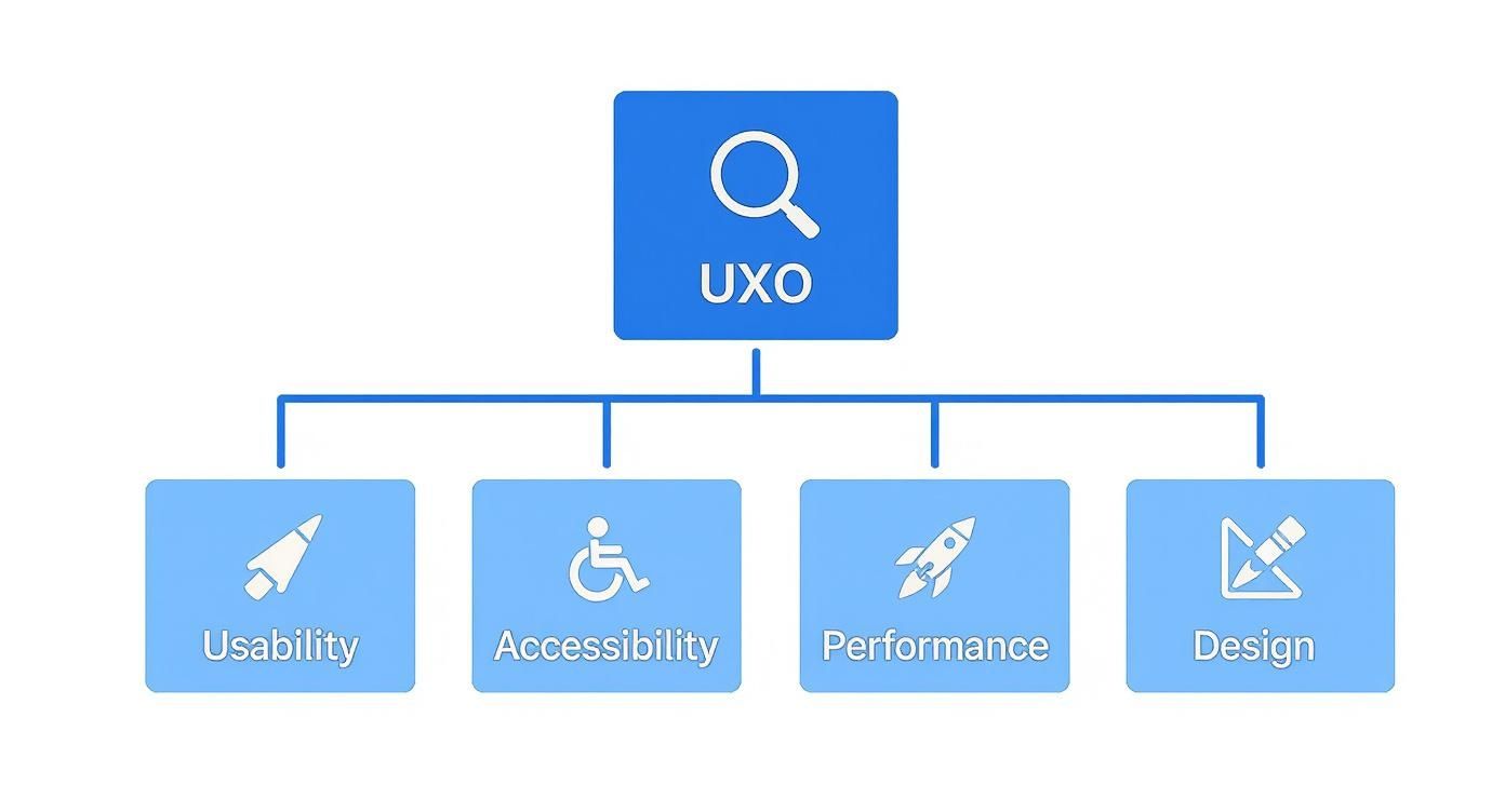
As you can see, a successful UXO strategy isn't just about one thing. It's a careful balance of usability, accessibility, performance, and design that creates that smooth and effective experience we're all after.
Let's break these down into a simple table to see how they fit together.
The Four Pillars of User Experience Optimization
This table breaks down the essential components of UX optimization, explaining what each pillar means for your website and its users.
| Pillar | Core Focus | Impact on Users |
|---|---|---|
| Usability | How intuitive and easy is your site to navigate and use? This covers everything from logical menus to clear calls-to-action. | Users can find what they need quickly and accomplish their goals without frustration or confusion. |
| Accessibility | Can people with diverse abilities and needs fully access your site? Think screen reader compatibility and keyboard navigation. | Everyone, regardless of physical or cognitive ability, has an equal opportunity to interact with your content. |
| Performance | How fast, stable, and responsive is your website? Slow load times and glitches are major pain points. | Visitors have a quick, seamless experience without waiting for pages to load or dealing with errors. |
| Design | How does the visual look and feel of your site affect the user's perception and emotional response? | A professional, appealing design builds trust and makes the entire interaction more enjoyable. |
By consistently evaluating your site against these four pillars, you can build a comprehensive and effective UXO strategy that covers all the bases.
Why Prioritizing UX Matters
Investing in user experience optimization isn't just a "nice-to-have" or a way to make users feel warm and fuzzy. It's a core driver of business growth with a direct, measurable impact on your bottom line.
A strong focus on user experience transforms casual visitors into loyal customers. When users feel understood and valued, they are more likely to convert, return, and recommend your brand to others.
The numbers don't lie. For every dollar you invest in UX/UI design, you can see a return of anywhere from $10 to $100. A thoughtfully designed user experience can boost conversion rates by an incredible 400%.
On the flip side, the stakes for getting it wrong are high. A massive 88% of users say they won't return to a site after a bad experience. And according to a report from the Arounda Agency, slow-loading pages alone cause an estimated $2.6 billion in lost sales each year. The message is clear: great UX is great for business.
Putting Core UX Principles Into Practice

A truly exceptional user experience never happens by accident. It's the result of carefully applying core psychological principles to digital design. When you understand these foundational rules, you can stop guessing and start making intentional choices that guide users, eliminate friction, and make your website feel completely intuitive. These principles are the blueprint for effective user experience optimization.
By weaving them into your design process, you learn to anticipate what users will do and build interfaces that match how the human brain works. This is where theory gets real, turning abstract ideas into concrete improvements that drive up engagement and, ultimately, conversions. Let's dig into a couple of the most powerful principles you can use right away.
Simplify Choices with Hick's Law
Hick's Law is a simple but powerful idea: the more choices you give someone, the longer it takes them to make a decision.
Ever been paralyzed by a restaurant menu with 50 different options? That's Hick's Law in action. A focused menu with five amazing dishes feels manageable and confident. The same logic applies directly to your website. Overloading users with too many navigation links, form fields, or calls-to-action creates cognitive friction, leading to confusion and abandonment.
Key Takeaway: Every choice you add increases your user's mental load. To make their journey smoother, curate their options and gently guide them toward the actions that matter most.
Amazon is a master of this, even with a product catalog in the millions. Their homepage doesn't show you everything at once. Instead, it offers a limited, personalized selection and a handful of clear categories. This approach makes a massive marketplace feel approachable, simplifying that crucial first decision and pulling users into a well-defined shopping path.
Make Important Actions Easy to Reach with Fitts's Law
Fitts's Law is another cornerstone of interaction design, and it’s all about physical effort. It states that the time it takes to click a target (like a button) depends on how far away it is and how big it is. Put simply, larger and closer buttons are easier and faster to click.
This principle is absolutely critical for mobile design, where users are tapping with their thumbs on a small screen. Placing your main navigation or a "Buy Now" button within the thumb's natural resting arc makes the entire experience feel effortless. On the flip side, tiny buttons tucked away in a corner are a recipe for frustration and lost sales.
Here's how to put Fitts's Law to work in your own user experience optimization efforts:
- Make primary CTAs bigger: Your most important call-to-action buttons should be noticeably larger than secondary links.
- Keep related items close: A "Submit" button should live directly below the last form field it belongs to, not halfway down the page.
- Use the screen edges: The edges and corners of the screen are easy to hit without overshooting, which makes them prime real estate for sticky menus or floating action buttons.
Think about the big, impossible-to-miss "Add to Cart" button on just about every eCommerce product page. Its size and placement aren't a coincidence. It's designed to be the easiest, most obvious thing to click on the screen—a perfect, real-world application of Fitts's Law that directly drives revenue.
How to Measure and Test Your UX
Great UX doesn't happen by accident. It's not about guesswork or following your gut—it's about a disciplined process that connects smart design to real business outcomes. If you want to make changes that actually move the needle, you have to stop assuming what your users want and start measuring what they do.
This means looking at two sides of the same coin: the hard numbers (quantitative data) and the human stories behind them (qualitative feedback).
Think of yourself as a detective at a crime scene. The quantitative data—the footprints, the time of entry—tells you what happened. But the qualitative evidence—the witness interviews, the motives—tells you why it happened. You need both to solve the case.
Understanding Quantitative UX Metrics
Quantitative metrics are your vital signs. They are the cold, hard numbers that tell you what’s happening on your site, giving you an objective look at performance and flagging potential trouble spots. These numbers are essential for tracking progress and proving the value of your UX improvements.
Here are a few of the most critical metrics you should be watching:
- Bounce Rate: This is the percentage of people who land on a page and leave without doing anything else—no clicks, no navigation, nothing. A high bounce rate is a red flag. It could mean your content missed the mark, the page is too slow, or the design is just plain confusing.
- Task Success Rate (TSR): This measures how many users actually manage to complete a specific goal, like filling out your contact form or finding a particular product. If only 40% of your users can finish the checkout process, you’ve just found a massive, measurable problem that needs fixing.
- Conversion Rate: For most businesses, this is the bottom line. It’s the percentage of visitors who take the action you want them to, whether that's making a purchase, signing up for your newsletter, or booking a demo.
Keeping an eye on these numbers gives you a fantastic high-level view of your site's health. When you're ready to go deeper, you can explore a whole range of customer experience metrics to get more granular insights.
Exploring Qualitative Testing Methods
While the numbers tell you what is happening, qualitative methods tell you why. This is where you get the human context—the frustration, confusion, and delight that users feel as they interact with your site. To get real results, you need methods for uncovering truthful customer feedback, not just generic survey responses.
Qualitative testing is like watching game film after a match. You see the exact moment a play broke down, hear the thought process behind a decision, and understand the real-world context in a way that statistics alone can't provide.
Here are three powerful methods you can use to get inside your users' heads.
Comparing UX Testing Methods
Choosing the right testing method can feel overwhelming, but it all comes down to what you want to learn. This table breaks down some of the most common approaches to help you decide which one fits your goals, timeline, and budget.
| Testing Method | What It Measures | Best For | Tools |
|---|---|---|---|
| A/B Testing | Which version of a page performs better against a single goal (e.g., clicks, sign-ups). | Optimizing specific elements like headlines, button colors, or calls-to-action. | Google Optimize, Optimizely |
| Heatmap Analysis | Where users click, scroll, and move their mouse on a page. | Understanding user attention and identifying if key elements are being ignored. | Hotjar, Clarity |
| Session Recordings | A full, anonymized video replay of a real user's session on your site. | Identifying specific friction points, bugs, or confusing navigation paths. | Hotjar, FullStory |
Ultimately, the best approach is often a mix of methods. You might spot a problem with heatmaps, form a hypothesis, and then validate it with an A/B test.
Diving Deeper into Testing Techniques
Let’s take a closer look at a few of these methods in action.
1. A/B Testing
This is a classic for a reason. You create two versions of a page (an 'A' and a 'B') with one small difference, like a new headline or a different button color. You show each version to a different group of users and see which one performs better. It’s a clean, scientific way to make data-driven decisions on individual page elements.
2. Heatmap Analysis
Heatmaps give you a visual story of user behavior. They generate a color-coded overlay on your page, showing "hot spots" where everyone is clicking and "cold spots" that get completely ignored. It’s an incredibly powerful tool for seeing if your most important calls-to-action are getting the attention they deserve.
3. Session Recordings
This is as close as you can get to sitting next to your users as they browse your site. Session recordings are anonymized videos of real user journeys. You can watch them scroll, hesitate, and rage-click when they run into a bug. It's a fantastic way to build empathy and uncover friction points you never would have noticed on your own.
Practical Strategies to Improve Website UX

Alright, we’ve covered the theory and the metrics. Now it's time to get our hands dirty and put that knowledge into action. This is where we move from understanding why UX optimization matters to how you can actually do it. Let's dive into some concrete, high-impact strategies you can start using on your website today.
We're going to focus on the areas that give you the most bang for your buck. From cleaning up your site's navigation to making your forms less of a headache, these tactics are all about creating a smoother, more intuitive journey for every single visitor. The goal is simple: turn potential frustration points into seamless interactions that guide people right where they need to go.
Simplify Your Website Navigation
Think of your website's navigation menu as the signs in a massive department store. If they're confusing, cluttered, or make no sense, shoppers will get lost, frustrated, and walk right out. Simple, intuitive navigation is the absolute backbone of a good user experience.
Your main menu should be short, sweet, and use plain English. This isn't the place to get clever with industry jargon; stick to straightforward terms that instantly tell people what they'll find on the other side of the click.
Here are a few quick wins to clean things up:
- Limit Your Menu Items: Try to stick to seven or fewer items in your main navigation. This prevents "analysis paralysis" where too many choices lead to no choice at all.
- Use Descriptive Labels: Instead of a generic label like "Services," why not be more specific? If your main offerings are "Web Design" and "SEO Audits," use those instead.
- Give Them a Clear Path Home: People expect your logo in the top-left corner to take them back to the homepage. Don't break this universal rule.
Design a Flawless Mobile-First Experience
Let’s be clear: a mobile-friendly website isn't a "nice-to-have" anymore. It's a requirement. When you design for the smallest screen first, it forces you to focus on what’s truly essential, leading to a cleaner, more focused experience for everyone, no matter what device they're on. This mindset is at the heart of modern user experience optimization.
The data doesn't lie. A staggering 63% of organic search traffic now comes from mobile devices. What's more, over 53% of mobile users will ditch a site if it takes more than three seconds to load. And for businesses, 71% of companies report that well-organized mobile content directly leads to more positive customer feedback.
Key Insight: A website that’s a pain to use on a phone isn't just an annoyance; it’s a massive roadblock to conversions. You need touch-friendly buttons, fonts that are readable without pinching and zooming, and a layout that just works on any screen.
Optimize Site Search and Forms
When someone uses your site’s search bar, they have a clear mission. They're usually much closer to making a decision, and a clunky search experience can stop them in their tracks. A good search function needs to be fast, forgive typos, and deliver relevant, easy-to-scan results.
Forms are another critical-moment interaction. They're often the very last step before a conversion, whether it's a simple contact request or a major purchase. Every extra field you add introduces friction and increases the odds they'll just give up. In fact, a study found 65% of users will abandon a form if it asks for too much personal information.
Follow these best practices to fix your forms:
- Be a Minimalist: Only ask for what you absolutely need. If a field is optional, seriously consider cutting it.
- Use Clear Labels: Place labels above the input fields so it's perfectly clear what information is needed.
- Provide Real-Time Feedback: Don't wait until they hit "Submit" to tell them there's an error. Let them know instantly if a field is filled out incorrectly.
Putting these strategies into practice is one of the most direct ways to boost engagement. A great UX transforms your site from a static digital brochure into a powerful tool for growing your business. For instance, our guide on how to increase online sales details how a frictionless checkout is non-negotiable for eCommerce. Ultimately, learning how to effectively get clients from your website starts with creating an experience people actually enjoy.
Using AI for Smarter UX Optimization
Artificial intelligence is changing the game for user experience optimization. We're moving away from a manual, reactive process and into one that's dynamic and even predictive. Instead of just looking at what users did, AI tools can now anticipate their needs and personalize experiences in real-time. The result? Interactions that feel genuinely made for each individual.
Think about it this way: traditional UX work is like a skilled librarian. They’re fantastic, but they can only help one person at a time based on what they're asked. AI, on the other hand, is like giving every single visitor their own personal librarian who already knows their tastes and guides them to the perfect book before they even ask.
This isn't science fiction anymore. It's a practical toolkit businesses are using right now to build stronger connections and drive better results.
Personalizing the User Journey with AI
Hyper-personalization is where AI really shines in UX. Algorithms can watch a visitor's real-time behavior—the pages they browse, the products they look at, how long they linger—and use that data to serve up content, recommendations, and offers that are spot-on.
This is so much more than just sticking a user's name on the screen. We're talking about dynamically rearranging a homepage to show their interests or suggesting products that perfectly complement what's already in their cart. This kind of personal touch makes people feel seen and understood, which naturally boosts engagement and smoothly guides them toward making a purchase.
Automating Support with Intelligent Chatbots
AI-powered chatbots have turned customer support from a common frustration into a powerful engagement tool. Forget the old, clunky bots that followed rigid scripts. Today's AI assistants understand natural language, tap into huge knowledge bases, and deliver accurate answers to complex questions 24/7. This instant help dramatically improves the user experience by solving problems before they can turn into deal-breakers.
Intelligent chatbots do more than just answer questions. They become active participants in the user journey, offering proactive assistance, gathering valuable feedback, and identifying friction points that human teams might miss.
For WordPress site owners, this tech is incredibly accessible with tools like MxChat. These chatbots train on your own website content to provide answers that are perfectly in context. They use sophisticated systems like Retrieval-Augmented Generation (RAG) to pull precise details straight from your product descriptions or help docs, ensuring every response is relevant and helpful. You can learn more about what Retrieval-Augmented Generation is and how it’s making AI conversations so much smarter.
The Growing Impact of AI on UX
The move toward AI in UX optimization isn't just a fleeting trend—it's a massive market shift with real business impact. AI-driven UX tools are growing at an approximate compound annual growth rate (CAGR) of 38%, which tells you everything you need to know about their importance.
The results speak for themselves. Businesses are finding that AI can boost user engagement by up to 80% and increase sales by as much as 30% through personalized recommendations. Adoption is already widespread, with 73% of businesses now using AI chatbots to improve their customer interactions. Looking forward, 70% of companies plan to hire more UX pros with AI skills by 2025, cementing AI’s place as a fundamental part of any modern UX strategy.
UX Optimization for WordPress and eCommerce
Knowing the theories behind UX is one thing, but making them work on the platforms you actually use—that's where the magic happens. Whether you're running a blog on WordPress or a store on WooCommerce or Shopify, each platform has its own quirks and best practices. Getting user experience optimization right in these spaces means making smart, platform-aware choices that boost both performance and usability.
If you have a WordPress site, the user experience starts before anyone even reads a single word. It begins with the technical foundation of your site.
For an eCommerce store, the same idea applies. Every single interaction, from the moment a customer lands on your homepage to that final click on the "Buy Now" button, is a make-or-break moment. Each step can either build trust and push the sale forward or create just enough friction to make someone abandon their cart.
Key Strategies for WordPress Sites
Getting a WordPress site right is all about striking a balance between speed, cool features, and a great look. Your first big decision? The theme. A lightweight, cleanly coded theme sets you up for success with a fast foundation that a bloated, overly complex theme just can't compete with.
Of course, plugins are a huge part of the WordPress world. They can add incredible functionality, but piling on too many—or choosing poorly coded ones—will grind your site to a halt.
- Choose a Performance-Focused Theme: Start with themes known for speed and solid code, like Astra or GeneratePress. This gives you a snappy experience right out of the box.
- Leverage Essential Plugins: A good caching plugin (like W3 Total Cache) is non-negotiable for serving pages quickly. Pair it with an image optimizer (like Smush) to shrink file sizes without making your photos look grainy.
- Structure Content for Readability: Don't hit your visitors with a wall of text. Break up long posts with short paragraphs, clear H3 subheadings, bullet points, and relevant images. This makes your content easy to scan and keeps people reading.
Driving Sales with eCommerce UX
When it comes to eCommerce, a smooth user journey is directly connected to your bottom line. You want to make finding and buying products feel completely effortless. A confusing layout or a slow-loading page is a surefire way to kill a sale. In fact, cart abandonment rates are stuck at around 70%, and a clunky checkout process is one of the main reasons why.
A streamlined eCommerce experience removes doubt and builds confidence at every step. From intuitive product filters to a transparent, one-page checkout, every optimization is a direct investment in your conversion rate.
The best way to fight cart abandonment is to focus on clarity and speed from start to finish. Make it ridiculously easy for shoppers to find what they want with powerful search and filtering tools. By the time they get to checkout, it should feel like a simple formality, not a final obstacle course. For a closer look at this, you can learn how to optimize user experience with proven tactics for cutting friction and increasing sales.
Frequently Asked Questions
What Is the Difference Between UX and UI?
It's a common question, and one of the best ways to think about it is by imagining a car.
The User Interface (UI) is everything you see and touch on the dashboard—the look of the speedometer, the color of the radio buttons, the texture of the steering wheel. It's the aesthetics and the individual components.
The User Experience (UX), on the other hand, is the entire drive. How smooth is the ride? Can you easily change the radio station without taking your eyes off the road? Do you get to your destination feeling relaxed or completely frustrated? That's the experience.
A website can have a gorgeous UI with slick buttons and a modern design, but if the site is slow or those beautiful buttons are impossible to find, the UX is a failure. User experience optimization is all about making sure that entire journey feels intuitive and effortless.
How Can I Measure the ROI of UX Optimization?
You can absolutely connect your UX efforts to real money. The trick is to track key performance indicators (KPIs) that are tied directly to your bottom line, both before and after you make any changes.
When you can link a UX improvement to a tangible business outcome, its value becomes crystal clear. For example, if you redesign your checkout process and your conversion rate jumps from 2% to 3%, that’s a direct, calculable impact on your revenue.
Keep a close eye on a few key metrics:
- Conversion Rate: What percentage of your visitors are actually completing a goal, like buying a product?
- Average Order Value (AOV): How much is the average customer spending in a single transaction?
- Customer Support Tickets: Are you getting fewer confused emails and support requests? A drop here is a great sign that your site is becoming easier to navigate.
How Often Should I Conduct UX Testing?
Think of UX optimization as an ongoing process, not a one-and-done project. It’s a cycle of continuous improvement.
You should definitely run tests whenever you launch a new feature, redesign an important page, or see a sudden, unexplained drop in a core metric like your conversion rate.
But for real, proactive growth, it's best to build a habit of regular, small-scale testing. Running monthly A/B tests on the most critical parts of your user journey—like your homepage or checkout flow—can lead to massive cumulative gains over time. This approach ensures your site is constantly evolving to meet your users' expectations.
Ready to enhance your website's user experience with a 24/7 AI assistant? MxChat allows you to build intelligent, no-code chatbots that answer questions, capture leads, and guide users effortlessly. Discover how MxChat can help.