How to Optimize User Experience on WordPress
To really nail your user experience, you have to stop guessing what your visitors want and start watching what they actually do. It's all about stepping out of your own shoes and gathering real data on how people move through your WordPress site. This is how you find the sticking points and, more importantly, the hidden opportunities to make things better.
Auditing Your Current WordPress User Experience

A dashboard like this one from a tool such as Microsoft Clarity is your window into the user's mind. It shows you exactly where people are clicking and where they aren't. This kind of visual data is incredibly powerful for pointing you directly to the elements that work and those that get completely ignored.
Before you touch a single line of code or change a button color, you need a baseline. An audit isn't about buying expensive software; it's about using free, accessible tools to see your site through your users' eyes. This is how you uncover the "why" behind their behavior.
Are they getting frustrated and rage-clicking on a logo that isn't a link? Do they give up on a form halfway through? These are the golden nuggets of insight a proper audit delivers, turning assumptions into actionable facts.
Gathering Behavioral Data with Free Tools
First things first, let's get some tools in place to capture what's happening on your site. Heatmaps and session recordings are your best friends here, and thankfully, many services offer generous free plans that are perfect for getting started.
Heatmaps give you that "at-a-glance" overview—a color-coded map showing where people click, how far down the page they scroll, and where their mouse hovers. Hot spots mean high engagement; cold spots are getting ignored.
Session recordings take it a step further. They are essentially video playbacks of a user's entire journey on your site. You can watch them hesitate, struggle to find something, or breeze right through. It's the closest you can get to looking over their shoulder.
These tools aren't just a "nice-to-have" anymore. For example, the SaaS company Supademo used session replays to figure out where users were getting stuck in their onboarding. Armed with that knowledge, they tweaked the flow and cut down the time it took for a new user to understand the product by a whopping 39%. That's the power of data over guesswork.
Identifying Friction Points and Quick Wins
After letting these tools collect data for a week or two, it’s time to dig in and look for patterns. Don’t let the amount of data intimidate you. Your job is to spot the recurring problems.
Keep an eye out for these common signs of trouble:
- Rage Clicks: When you see a user furiously clicking on something that isn’t interactive, you’ve found a major point of frustration and a clear design flaw.
- High Drop-Offs: If people are consistently bailing on your pricing or checkout pages, something is wrong. It could be a lack of trust, confusing information, or a technical bug.
- U-Turns: A user lands on a page only to hit the back button immediately. This is a dead giveaway that the content didn't match their expectations.
- Ignored CTAs: Your main call-to-action button is sitting there, cold as ice on the heatmap. Maybe it's in the wrong spot, doesn't stand out, or the text just isn't compelling enough.
The point of a UX audit isn't to find every single flaw. It's to identify the 20% of problems causing 80% of the friction. Focus on the fixes that will deliver the biggest impact for the most people.
For instance, after watching a handful of session recordings, you might notice that your mobile menu is a nightmare to navigate. Fixing that one thing could instantly improve the experience for more than half of your traffic.
Below is a quick-reference table summarizing some of the most common issues you'll likely uncover and the first steps you can take to address them.
Common UX Issues and Actionable Fixes
| Identified Issue | Potential Cause | First Actionable Step |
|---|---|---|
| High bounce rate on landing pages | Page load speed is too slow, or content is irrelevant to the ad/source. | Run a speed test with Google PageSpeed Insights and check content alignment. |
| Users ignore the primary CTA | Poor visibility, weak copy, or placement is too low on the page. | A/B test a new button color or change the copy to be more action-oriented. |
| Low form completion rates | The form is too long, asks for sensitive info too early, or has errors. | Remove non-essential fields and ensure error messages are clear and helpful. |
| "Rage clicking" on non-links | Visual design incorrectly suggests an element is clickable (e.g., underlined text). | Remove the styling that implies interactivity or make the element clickable. |
| Mobile users drop off quickly | The site is not fully responsive, or touch targets are too small. | Test the site on multiple devices and increase the size of buttons and links. |
This table isn't exhaustive, but it provides a solid starting point for turning your audit findings into a concrete to-do list.
Don't forget that slow page speed is a massive source of friction. If you're seeing performance-related issues, we have detailed guidance in our article on choosing the best cache plugin for WordPress that can help you speed things up. By grounding your efforts in real user behavior, every change you make will be targeted, effective, and directly contribute to a better experience on your site.
Once your audit shows you exactly where people are getting stuck, one of the fastest ways to help is by adding an AI assistant. A well-placed chatbot from MxChat can answer questions on the spot, guide lost visitors, and turn frustration into a genuinely helpful interaction. That’s a huge win when you’re trying to optimize user experience.
The trick is to be strategic. Simply flipping the switch on a chatbot isn't enough. With MxChat, the technical part of getting it on your WordPress site is a breeze. The real work—and the real payoff—comes from how you configure it from the start. This is your chance to turn a generic bot into a valuable team member.
Crafting the Perfect First Impression
Think of your chatbot’s first message as its digital handshake. It sets the entire mood. Get it wrong, and users will close the widget without a second thought. An overly aggressive popup is just annoying, but one that’s too passive will never get used.
You’re aiming for proactively helpful, not disruptive.
Context is everything. If someone is on a complicated pricing page, a greeting like, "Confused about our plans? I can help you compare them," is a lifesaver. On a deep-dive blog post, something softer works better, like, "Found this article useful? Ask me anything else about this topic."
Your chatbot’s opening line should be a super-relevant call to action. It needs to offer instant value based on what the user is likely doing on that specific page. Ditch the generic "How can I help?" for something that shows you get them.
This approach makes the bot feel like an intelligent resource that understands the user’s journey, not just another automated popup.
Defining Your Chatbot’s Voice and Tone
Trust is built on consistency. Your chatbot’s personality has to be a perfect match for your brand's voice. Are you fun and a bit quirky? Or are you the serious, trusted authority? Nail this down from the beginning, so the AI’s answers never feel out of place.
I always focus on these three things:
- Vocabulary: Do you use a lot of industry jargon, or is your brand all about simple, clear language? Make sure the AI speaks the same language as the rest of your site.
- Friendliness: How warm should it be? Decide if it should use emojis and a casual tone or stick to a more formal, direct approach.
- Helpfulness: Its entire persona should be that of a capable assistant. Using phrases like "Let me find that for you" or "Here is the guide you need" reinforces its role as a problem-solver.
For the nitty-gritty of the installation, our guide on how to add an AI chatbot to your WordPress site with MxChat covers all the technical steps. It'll get you up and running fast, so you can spend your time on these more strategic decisions.
Real-World Examples of Greetings That Work
Let’s see what this looks like in the real world. A generic greeting is easy to ignore. A specific one gets attention because it offers a solution to a problem someone is probably having right now.
Here's a simple before-and-after comparison:
| Generic Greeting | Strategic, Context-Aware Greeting | Why It Works Better |
|---|---|---|
| "Hi! How can I help you today?" | "Struggling to find a feature? Ask me, and I'll point you to the right guide." | On a help desk or knowledge base, this anticipates frustration and offers a shortcut. |
| "Got questions?" | "Welcome back! Can I help you find your recent order status?" | For a returning e-commerce customer, this is immediately useful and feels personal. |
| "Chat with us!" | "Ready to start a project? Tell me your requirements, and I can give you a rough quote." | On a service business website, this greeting moves the conversation toward a conversion. |
By personalizing the chatbot’s introduction and personality, you’re not just adding a feature. You're building an interactive tool that genuinely helps people and makes their experience on your site better. This kind of proactive, intelligent support is a cornerstone of a fantastic user experience.
Building a Custom Chatbot Knowledge Base
Let's be honest. Nothing kills a user's confidence faster than a chatbot that replies with, "I'm sorry, I don't understand." It’s a dead end. That kind of friction completely undermines why you added an AI assistant in the first place—to give people fast, helpful answers.
To truly optimize user experience, your chatbot can't just be a digital greeter. It needs to be a subject matter expert on your business, your products, and your policies. This is where building a dedicated knowledge base comes in. You’re essentially creating a custom "brain" for your chatbot, using your own content as the source of truth.
The Magic Behind the Curtain: Retrieval-Augmented Generation (RAG)
So how does this actually work? The technology making it happen is called Retrieval-Augmented Generation (RAG). The best way to think about it is like giving your AI an open-book test. Instead of trying to recall answers from the vast, often messy public internet, RAG forces the chatbot to look up information directly from the specific documents you provide.
When a visitor asks a question, the system first scans your knowledge base for the most relevant snippets of text. It then uses those facts to "augment" its answer, ensuring the information is grounded in reality. This simple process is a game-changer. It virtually eliminates those generic, unhelpful replies and stops the AI from "hallucinating"—a fancy term for making up incorrect information about your company.
With RAG, you're not just installing a chatbot; you're deploying a specialist. It transforms your AI from a generalist that knows a little about everything into an expert that knows everything about your business. That shift is what creates a genuinely helpful and trustworthy automated experience.
Feeding Your Chatbot the Right Information
Getting your MxChat knowledge base set up is surprisingly straightforward. The whole idea is to point the AI to the sources of truth on your WordPress site, giving you total control over what it learns. This ensures it only pulls from approved, up-to-date content.
You have a few options for feeding your chatbot information:
- Specific URLs: Got a critical landing page, a detailed service description, or a blog post that answers a common question? Just feed it the URL, and MxChat will digest the content.
- WordPress Post Types: You can tell the chatbot to learn from all of your blog posts, pages, or even custom post types like "Products" or "Case Studies." This is a fantastic way to train it on a large volume of content quickly.
- Document Uploads: What about information that isn't on a public page? Think internal price lists, detailed tech specs, or internal support scripts. You can upload files like PDFs directly into the knowledge base.
For example, an e-commerce store could train its bot on all its WooCommerce product pages. Suddenly, it can answer specific questions about inventory, materials, or dimensions. A B2B service company might upload detailed PDF case studies, enabling the bot to discuss real-world project outcomes with potential clients.
The entire process, from installation to launch, follows a logical flow. You start with the basics and build from there.
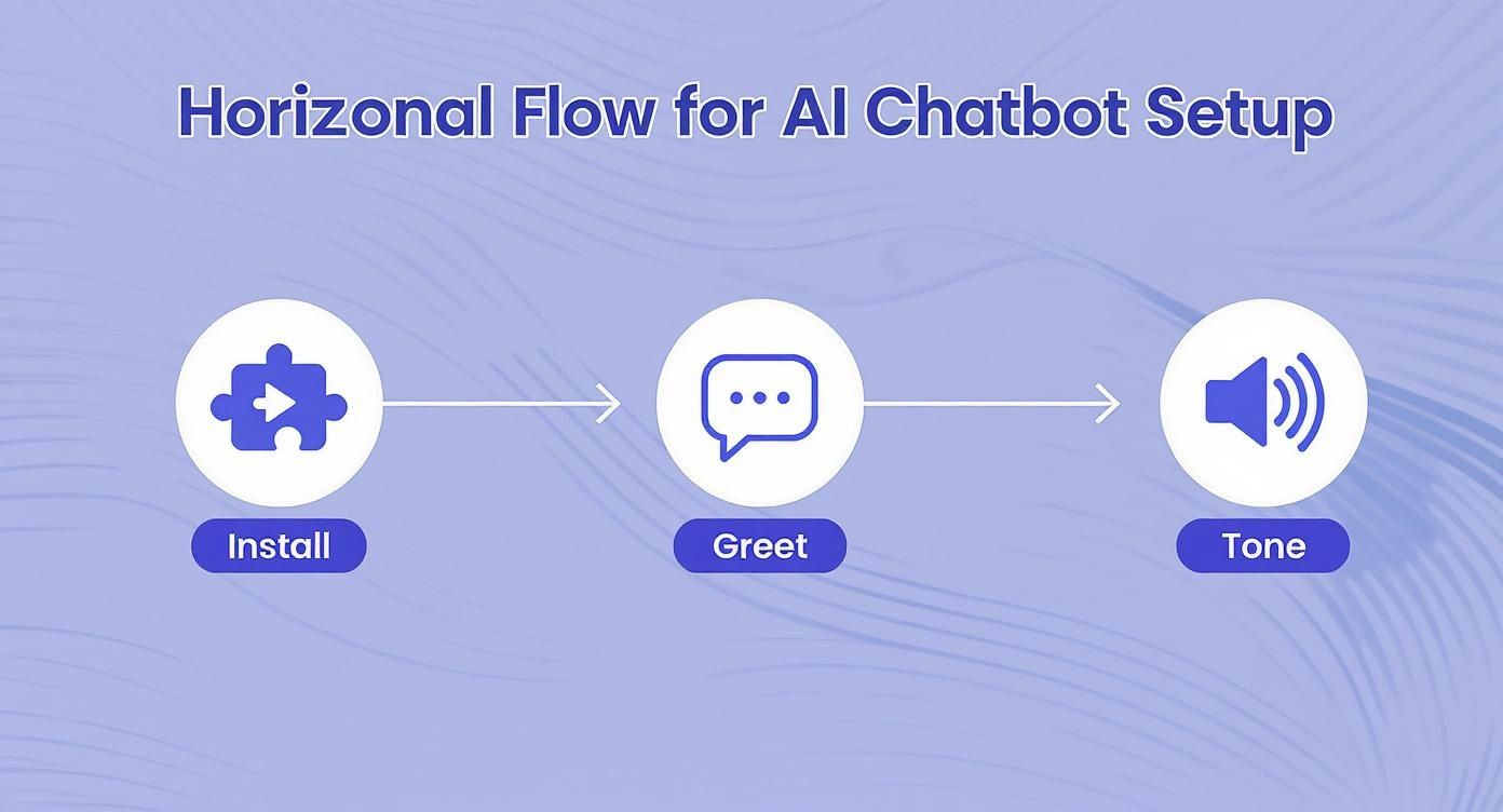
As you can see, it all starts with a seamless installation, moves to crafting that all-important welcome message, and then involves setting a consistent tone of voice.
Best Practices for Structuring Your Content
Here's a crucial piece of advice: the quality of your chatbot's answers is directly tied to the quality of the content you give it. A messy, disorganized knowledge base will lead to messy, disorganized answers.
To set your AI up for success, follow these tips:
- Create a Dedicated FAQ Page: This is probably the single most valuable asset you can create. Structure it with clear questions as headings (H2s or H3s) and provide concise, direct answers right below them.
- Use Clear Headings and Short Paragraphs: Don't make the AI wade through a wall of text. Break up long articles with descriptive subheadings so it can quickly understand the context of each section.
- Be Consistent with Terminology: Always use the same names for your products, features, and services. Inconsistency is a surefire way to confuse the AI and get muddled responses.
- Keep Your Sources Fresh: If you update your pricing or change a policy, remember to update the source document in your chatbot’s knowledge base. An AI quoting old information can do more harm than good.
By carefully curating what your chatbot learns, you create a powerful tool that delivers precise, helpful answers 24/7. This not only frees up your support team but also gives modern users the instant gratification they’ve come to expect.
To explore this further, check out our complete guide on building a knowledge base chatbot to enhance your WordPress site.
Designing an Intuitive Chat Experience
https://www.youtube.com/embed/N73tlcoizX8
So, you’ve got a smart AI chatbot powered by your own knowledge base. That's a huge win. But here's something I've learned over the years: the chatbot's raw intelligence is only half the story. To truly optimize the user experience, the chat interface itself has to be welcoming and dead simple to use.
The design of the conversation is just as critical as the accuracy of the answers. This is where we bridge the gap between a powerful tool and a genuinely helpful assistant. It's about tweaking the visual elements to make the chatbot feel like a part of your brand and structuring conversations to guide people toward solutions without any friction. A well-designed chat experience feels less like talking to a machine and more like getting help from a capable expert.
Aligning Chatbot Aesthetics with Your Brand
First impressions happen in a flash, and your chatbot's appearance is a massive factor in building trust right out of the gate. A generic blue chat widget on a website with a warm, earthy color scheme just feels… off. It's jarring and breaks the seamless experience you're trying to create.
With MxChat, you can easily get the look and feel just right. I always recommend starting with the basics:
- Colors: Match the chat window’s header, background, and message bubbles to your site's brand colors. It's a small change that makes a huge difference.
- Logo: Always upload your company logo. It's an instant signal of credibility and reinforces that the bot is an official part of your team.
- Avatar: Give your bot a face! It could be your brand icon, an abstract graphic, or a friendly illustration. An avatar makes the whole interaction feel much more personal.
These aren't just cosmetic changes. They create a cohesive experience that tells the user, "This is an official, trustworthy part of our website, not some random third-party add-on."
Structuring Conversational Flows for Quick Wins
Your AI is brilliant at handling complex, open-ended questions, but let's be realistic—many visitors show up with common problems or simple queries. Setting up the initial interaction with predefined questions or buttons is a fantastic way to get them answers faster. It basically turns your chatbot into an interactive FAQ.
Instead of a blank slate that forces the user to think and type, present them with common starting points.
Here's a pro-tip: Think about the top 3 to 5 reasons someone would need help on any given page. By offering those as clickable options, you remove the guesswork for the user and show you’re already anticipating their needs. That's a cornerstone of great UX.
For example, on your pricing page, you could kick things off with options like:
- "Compare plan features"
- "Ask about yearly discounts"
- "What's included in the free trial?"
This kind of proactive guidance helps people find what they need without the friction of trying to formulate the perfect question. To really nail this, it helps to incorporate essential user experience design patterns directly into your conversational flows.
Writing for Clarity and Conversation
The way your chatbot talks is just as important as what it knows. The tone should be clear, concise, and conversational. Ditch the technical jargon and robotic phrasing. My rule of thumb is to write as if I were explaining something to a customer in person.
Use simple formatting to make the bot's responses easy to scan. No one wants to squint at a wall of text in a tiny chat window.
- Short Paragraphs: Keep sentences and paragraphs brief and to the point.
- Bullet Points: Use lists to break down features, steps, or options.
- Bold Text: Emphasize key information like product names or important numbers.
This simple approach makes the information digestible and helps users find what they're looking for at a glance. A well-formatted, conversational response will always beat a single, dense block of text. As you refine these interactions, remember that continuous improvement is the name of the game. Our guide on how chatbot testing can boost engagement and user satisfaction offers a great framework for making those ongoing tweaks.
Measuring the Impact of Your UX Improvements
So, you've rolled out some changes to your WordPress site and fine-tuned your MxChat assistant. Now for the big question: Is any of it actually working?
To really optimize the user experience, you have to connect your actions to real business results. It’s time to move beyond guesswork and dive into the hard data. This is where you prove the value of your work and figure out what to do next.
This isn’t about staring at a single number. It’s about piecing together a story from key performance indicators (KPIs) that reveal how people are really using your site. When you track the right metrics, you can see exactly how a smoother user journey leads to better engagement, more conversions, and a healthier bottom line.
Key Metrics to Track in Google Analytics
Your best friend here is Google Analytics. It's packed with information on visitor interactions, giving you clear signals on whether your UX improvements are hitting the mark. Instead of getting bogged down in dozens of reports, just focus on a few core metrics that tell the most important part of the story.
Here’s a peek at a typical Google Analytics dashboard, where you can watch user activity and engagement trends in real-time.

This kind of overview is perfect for spotting quick changes in traffic or user sessions right after you’ve pushed a UX update live.
To get started, keep a close eye on these essential KPIs:
- Bounce Rate: A high bounce rate is a red flag—it means people land on a page and leave without doing anything else. If you see this number drop after a redesign or content refresh, that’s a fantastic sign that you're grabbing their attention more effectively.
- Time on Page / Average Session Duration: Are people sticking around longer? An increase here suggests your content is more compelling and your site is easier to get around. It's a direct measure of a good user experience.
- Pages Per Session: If visitors are clicking through to more pages each time they visit, it usually means your site architecture is working. They're finding what they need and are curious to explore more.
- Conversion Rate: This is the ultimate test. Whether your goal is a sale, a lead form submission, or a newsletter signup, a rising conversion rate is the clearest proof that your UX tweaks are making it easier for people to do what you want them to do.
Analyzing Chat Logs for Qualitative Insights
While Google Analytics gives you the "what," your MxChat logs tell you the "why." This is where you get unfiltered feedback straight from your users, in their own words. Sifting through these conversations is like having a direct line into your customers' thoughts, revealing pain points you'd never spot in numbers alone.
Make it a habit to review your chatbot transcripts. You’re looking for patterns.
Your chatbot's chat logs are a goldmine of qualitative data. Look for the questions that come up over and over again. These are clear signposts pointing directly to gaps in your content, confusing navigation, or unclear product descriptions.
For example, if you see dozens of users asking your chatbot, "Do you ship to Canada?" that’s a massive clue. It means your shipping policy page is either buried or the information isn't clear enough. By fixing that directly on your site, you can cut down on support tickets and smooth out the buying process for future customers. This kind of analysis helps you prioritize what to improve next.
Connecting UX to Business Outcomes and ROI
At the end of the day, it's all about demonstrating a clear return on investment (ROI). When you can link your UX work to financial results, you build a rock-solid case for continued investment in creating a better customer journey.
The connection is more powerful than most people think. Studies have shown that for every $1 invested in UX, the return can be as high as $100. That's a staggering 9,900% ROI. It’s not just about more sales, either. A small 5% boost in customer retention can increase profits by over 25%, which shows how much a great experience pays off in the long run.
To pull this all together, create a simple report that maps your UX metrics to your business KPIs. Once your improvements are live, it's crucial to measure their impact. You can even learn how to measure the success of your web accessibility efforts to add another layer of value to your analysis.
By showing that a lower bounce rate correlates with higher sales, or that a drop in support chats happened right after you launched a new FAQ page, you create a powerful story. You prove that putting your users first isn't just a nice idea—it's smart business.
Got Questions? Let's Get Them Answered
As you start digging into user experience, a few common questions always seem to pop up. I've been asked these countless times, so let's tackle them head-on and clear up any confusion you might have about putting these strategies into practice on your WordPress site.
How Often Should I Be Doing a UX Audit?
That's a great question, and the answer really has two parts. For a full-blown, deep-dive UX audit, you’ll want to block out time for that at least once a year. It’s also a must-do before any major site redesign. Think of this as your annual health check-up; it gives you a solid baseline and points you toward the big strategic wins.
But—and this is important—you shouldn't wait a whole year to see what's going on. UX monitoring needs to be a constant, ongoing thing. You should be peeking at heatmaps and watching session replays at least quarterly, if not monthly. This way, you catch those small, annoying friction points before they snowball into major headaches for your users.
A full audit is for big-picture strategy, but continuous monitoring is for agile, incremental improvements. Don't wait a year to fix something that’s frustrating users today. This constant feedback loop is essential to effectively optimize user experience over the long term.
Is Adding an AI Chatbot Going to Wreck My Site Speed?
This is a totally valid concern. After all, site speed is a massive part of a good user experience. The good news is that modern chatbots, especially tools like MxChat, are built from the ground up to be incredibly lightweight.
They’re designed to load asynchronously, which is just a technical way of saying the chatbot script loads separately from the rest of your site’s content. Because of this, you really shouldn't see any noticeable hit to your performance or your PageSpeed scores. Of course, it’s always smart to run a quick before-and-after speed test, but a well-built plugin is designed to play nice and stay out of the way. You can absolutely have a fast site and a helpful chatbot.
What Kind of Content Should I Feed My Chatbot's Knowledge Base?
Your chatbot is only as smart as the information you give it. For it to give great answers, you need to feed it clear, well-structured, and genuinely helpful content.
The best place to start is with what you already have. Here’s a quick checklist of your best source material:
- FAQ Pages: This is the low-hanging fruit. The question-and-answer format is perfect for a chatbot to learn from.
- Support Documentation: If you have help docs or technical guides, these are goldmines for answering specific, detailed user questions.
- Product/Service Pages: This is where all the core info about what you offer lives. The bot needs to know it inside and out.
- Key Blog Posts: Those in-depth articles that walk users through solving a problem? Perfect.
Pro tip: If you see the chatbot (or your support team) getting asked the same questions over and over, and the answer isn't on your site—that's your cue. Go create a new page or a blog post that covers it. Using clear headings, short paragraphs, and lists in your content makes it much easier for the AI to understand and pull out the right information.
Ready to transform your WordPress site's user experience? With MxChat, you can deploy an intelligent AI assistant that provides instant, accurate answers 24/7. Start building your custom chatbot today and turn visitors into satisfied customers.