How to Increase Sales Conversion Rate A Modern Playbook
If you want to increase your sales conversion rate, you first need to know where you're starting from. The only way to do that is by tracking your current performance and setting realistic, industry-specific goals. It's about building a strategy based on hard evidence, not just guesswork.
Establishing Your Baseline and Setting Realistic Goals
You can't improve what you don't measure. Before you even think about tweaking button colors or rewriting product descriptions, you need a solid foundation. If you want a deep dive, there are plenty of proven strategies to boost website conversion rates out there, but they all start in the same place: knowing your numbers.
The first step in any real conversion rate optimization (CRO) journey is establishing a data-backed baseline. That means getting cozy with Google Analytics. If you haven't set up e-commerce tracking for your WooCommerce store yet, stop what you're doing and get that handled. It’s non-negotiable. Without it, you're flying blind.
Understanding Industry Benchmarks
Once you have your conversion rate, the inevitable question pops up: "So, is that any good?"
Well, it depends. The global average e-commerce conversion rate floats around 3.34%, but that number is pretty useless on its own. The real magic is in the details. Top-tier sites can see rates north of 11%, while others struggle to break 1%. Context is everything.
For example, a store selling gourmet coffee might see rates between 4.9% and 7.06%, whereas a high-end watch brand might consider 1.5% a huge win. Knowing where your industry typically lands keeps you from chasing impossible goals.
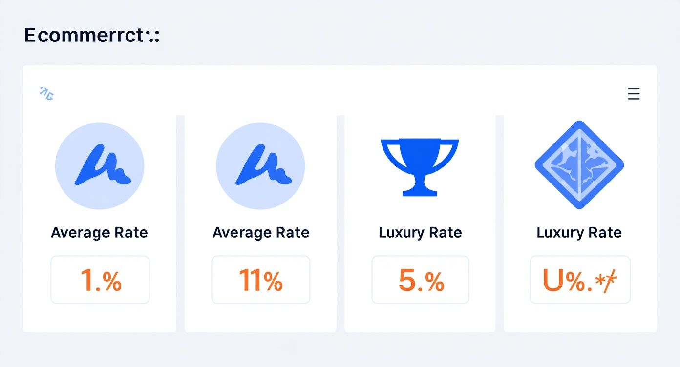
As you can see, the gap between "average" and "excellent" is massive. That’s why you need to benchmark against your direct competitors, not some global average.
E-commerce Conversion Rate Benchmarks by Industry
To give you a clearer picture, here’s a quick reference table. See how your store stacks up against the averages in your niche.
| Industry | Average Conversion Rate | Top Performer Rate |
|---|---|---|
| Food & Beverage | 4.9% | 7.06% |
| Health & Beauty | 3.6% | 5.4% |
| Fashion & Apparel | 2.4% | 4.6% |
| Home & Garden | 2.1% | 3.9% |
| Luxury & Jewelry | 1.2% | 2.1% |
This data helps ground your expectations in reality, giving you a much better starting point for setting your own goals.
Setting Up Proper Conversion Tracking
With your benchmarks in mind, you can finally set an achievable goal. A great place to start is aiming for a 10-15% improvement over your current baseline within the next quarter. It’s ambitious but doable.
The best way to keep an eye on your progress is by setting up a dedicated "Transactions" report in Google Analytics. This will become your single source of truth.
Key Takeaway: The goal isn’t to dethrone the industry leader in a month. It’s to make consistent, measurable gains from where you are today. That’s how you build momentum and create a CRO strategy that actually lasts.
This whole process of tracking and goal-setting is the bedrock of improving your site’s performance. It also provides valuable insights that feed into other critical areas of your business, which you can learn more about in our guide to customer experience metrics. Ultimately, having a clear baseline and realistic targets turns CRO from a bunch of random tactics into a focused plan for growth.
Uncovering Friction Points in Your Customer Journey
If you want to boost your conversion rate, you have to stop looking at spreadsheets and start looking at your store the way your customers do. A great customer experience feels effortless, but building one means you first have to become a detective, hunting down every point of friction that gets in the way of a sale.
This is where you go beyond the numbers. Tools like session recordings and heatmaps are your secret weapon. Think of them as giving you a behind-the-scenes look at how real people navigate your site. You can use free tools like Microsoft Clarity or paid options like Hotjar to watch anonymous recordings of actual user sessions. You’ll see every click, every scroll, and every moment they get stuck.
Reading the Digital Body Language
Once you start watching these recordings, you'll see things that Google Analytics could never tell you. These are the little moments of frustration that kill conversions, and they’re pure gold for optimization.
Keep an eye out for these tell-tale signs of a struggling user:
- Rage Clicks: This is when someone repeatedly clicks on something that isn't a link—like a static image they assume is a button. It’s a dead giveaway that your UI is confusing.
- U-Turns: A visitor lands on a page, only to immediately hit the back button and try something else. This usually means the page didn't meet their expectations or the content was irrelevant.
- Frantic Scrolling: You'll see users scrolling up and down a page like a madman. They're clearly looking for something they can't find, like shipping details or a return policy.
Each of these behaviors is a direct signal that something is broken. And every broken experience is a prime opportunity for a fix. You can dive deeper into these strategies in our complete guide to user experience optimization.
Turning Observations into Actionable Hypotheses
Spotting the problem is only half the battle. The real magic happens when you turn those observations into educated guesses—or hypotheses—that you can actually test. Don't just make a vague note like, "The navigation is bad." Get specific.
For example: "I watched five different user sessions where people rage-clicked the main homepage banner. My hypothesis is that if we make that banner a clickable link pointing to the featured collection, we'll see a higher click-through rate and less user frustration."
See the difference? You’ve just turned a fuzzy problem into a clear, measurable test.
It's also absolutely critical to look at this behavior on different devices. It's no secret that desktop users tend to convert at higher rates (around 4.8%) than mobile users (around 2.9%), even though mobile often brings in most of the traffic. You can find more stats on this over at digitalwebsolutions.com. This gap tells you just how important—and how difficult—it is to get the mobile journey right. By methodically mapping out these friction points, you're not just guessing anymore; you're building a data-driven roadmap to a higher conversion rate.
Alright, you've pinpointed the friction in your customer journey. Now for the fun part: rolling up our sleeves and making the on-site changes that actually move the needle on your sales conversion rate. This is where a casual browser decides to become a paying customer, and it all comes down to the experience you create and the trust you build.

It all starts with how you talk about your products. Let's be honest, generic feature lists are boring and they don't sell. Benefits do. Your copy needs to immediately answer the two questions bouncing around every visitor's head: "What's in it for me?" and "How does this actually solve my problem?"
Write Product Copy That Speaks to Benefits, Not Just Features
To write copy that truly connects, you have to get out of your own head and step directly into your customer's shoes. Stop thinking about what your product is and start focusing on what it does for them.
Take a high-end camping tent, for example. Describing it as "made with waterproof ripstop nylon" is technically accurate, but it's not compelling. Instead, try this: "This tent keeps your family dry and safe during unexpected downpours, so you can create lasting memories without a single worry." See the difference? We shifted from a dry feature to an emotional benefit, and that's what drives purchasing decisions.
Pro Tip: I use a little trick called the "so that" test. Frame every feature with a direct benefit. For example: "Our backpack has ergonomic straps (feature) so that you can hike for hours without any shoulder pain (benefit)." This simple structure forces you to focus on the customer's outcome.
This approach doesn't just describe a product; it helps shoppers visualize themselves using it successfully. That mental leap is a huge step toward boosting your sales conversion rate.
Use Social Proof and Great Visuals to Build Instant Credibility
In the world of e-commerce, words can only take you so far. Trust is built visually and socially. Since your customers can't physically touch or hold your products, you have to work overtime with crystal-clear images and undeniable social proof.
Your product visuals need to do some serious heavy lifting.
- Show Every Angle: Don't be shy. Provide high-resolution photos from every conceivable viewpoint.
- Use Lifestyle Shots: Show your product being used in a real-world setting. Help customers picture it in their own lives.
- Add a Video: A quick product demo can answer a dozen questions in under a minute and gives a massive confidence boost.
Right alongside those stunning visuals, you need powerful validation from other customers. Placing authentic reviews and testimonials directly on your product pages can increase conversions by an incredible 34%. There's simply no substitute for the credibility that comes from a real person's endorsement.
Design Calls-to-Action That Beg to Be Clicked
Finally, every single element on your page should be gently nudging the user toward a single, clear action. Your call-to-action (CTA) button is the final gateway to a sale, so its design and wording are critically important.
Get rid of generic CTAs like "Submit" or "Buy." Instead, use specific, action-oriented language that reminds the customer of the value they're getting. "Get Your Free Skincare Guide" is infinitely more persuasive than "Download Now."
Make your button pop. Use a contrasting color that stands out from the rest of the page, ensuring it's impossible to miss. Every click should feel like a confident step forward, not a blind leap of faith.
Designing a Frictionless Checkout to Reduce Abandonment
The path from "Add to Cart" to "Purchase Complete" is the most delicate—and often most frustrating—part of the entire customer journey. This is the moment of truth where a browser becomes a buyer, but it's also where a staggering 70% of carts are left behind. Every single piece of friction you can eliminate here directly translates into a higher sales conversion rate.

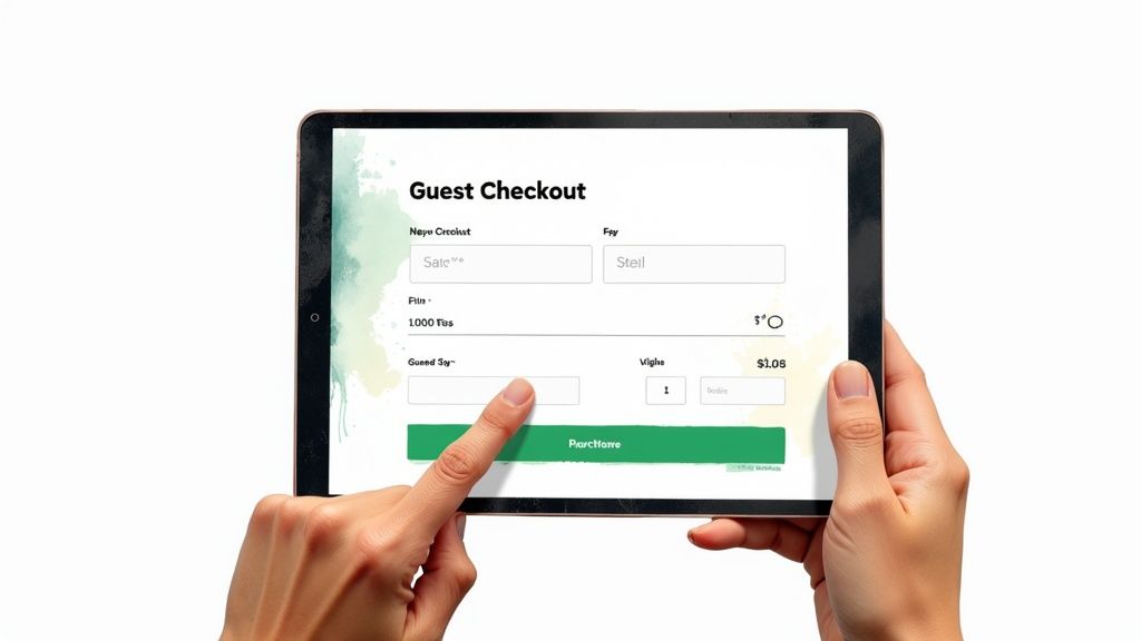
Think of your checkout as the final 100-meter dash of a marathon. The customer has already done the heavy lifting of browsing, comparing, and choosing. Your job is to make crossing that finish line as effortless as possible. And the biggest conversion killer by a long shot? Forcing users to create an account. It feels like a roadblock, an unnecessary commitment standing between them and their purchase.
Key Takeaway: Always, always offer a guest checkout option. This one change can have a massive impact on your conversions by removing the number one source of shopper frustration. People want speed and convenience, not another password to remember.
Simplify and Streamline Your Checkout Flow
Once you have guest checkout locked in, it's time to get ruthless with your form fields. Be honest: do you really need their phone number, company name, and a second address line to fulfill this order? Probably not. Every extra box is another micro-hesitation, another chance for a customer to bail.
Audit your checkout with a minimalist mindset:
- Ask for Essentials Only: Collect the bare minimum you need to process the payment and ship the product. You can always ask for more information in a post-purchase follow-up.
- Show the Way: A simple progress bar (e.g., Shipping > Payment > Review) gives customers a sense of control and shows them how close they are to being done. It reduces anxiety and keeps them moving forward.
- Build Confidence with Trust Seals: Make sure security badges (like SSL certificates) and familiar payment logos (Visa, PayPal, Apple Pay) are front and center. This visual reassurance tells customers their sensitive information is safe with you.
Speaking of payments, offering a variety of options isn't a "nice-to-have" anymore; it's essential. Not seeing a preferred method like PayPal or Apple Pay is a surprisingly common reason for someone to abandon their cart. Catering to these preferences is a straightforward but powerful way of improving ecommerce conversion rates.
Claw Back Lost Sales with Abandoned Cart Emails
Even with a perfectly slick checkout, people will get distracted and leave. Life happens. This is where abandoned cart recovery emails become your secret weapon for recouping lost revenue. These automated follow-ups are incredibly effective at nudging shoppers back to finish what they started.
Email marketing is still a powerhouse for boosting sales. Just look at back-in-stock notifications—a similar urgency-based tactic—which can hit conversion rates as high as 7.28%. That proves just how potent a timely, relevant email can be. A friendly reminder sent just a few hours after a cart is abandoned can recover a serious chunk of otherwise lost sales, turning those near-misses into money in the bank.
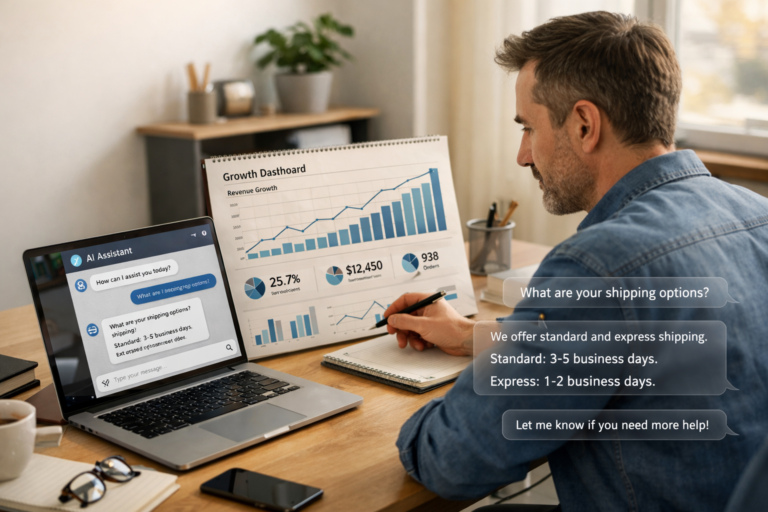
Using AI Chatbots for Proactive Conversion Wins
Modern optimization goes way beyond just tweaking static pages and button colors. If you really want to move the needle on your sales conversion rate, you need to turn your passive website into an active, intelligent sales assistant. This is precisely where AI chatbots, like those built with MxChat, shine by engaging visitors at the exact moment they need a hand.
Think about it. Instead of waiting for a customer to get frustrated and leave, an AI chatbot can step in proactively. Imagine a shopper lingering on a product page for more than 30 seconds. A well-timed chatbot can pop up with a helpful message: "Hey! Looks like you're checking out our hiking boots. Any questions about sizing or materials?" That simple interaction can be the difference between a bounce and a sale.
This kind of guided selling, where automated responses lead a user toward a solution or a purchase, is incredibly powerful. By answering questions instantly, you eliminate friction and build the confidence a customer needs to finally click "Add to Cart."
Intelligent Chat Flows and Personalization
The real magic of today's AI chatbots is their ability to understand context and personalize the conversation. They’re so much more than simple FAQ machines. For a deeper look into what makes them tick, you can learn more about AI chatbots and see how they’re changing customer engagement.
You can set up intelligent chat flows that trigger based on what a visitor is actually doing on your site:
- Browsing History: If someone has viewed three different coffee makers, the chatbot can offer a quick comparison or point out the best-selling model.
- Cart Contents: When a customer adds a camera to their cart, the bot can suggest a compatible memory card or lens filter, giving you an easy way to increase the average order value.
- Exit Intent: The moment a user’s cursor moves to leave the site, the chatbot can jump in with a last-minute discount code, giving them a reason to stick around and finish their purchase.
These automated, personalized interactions make the shopping experience feel guided and helpful, not pushy.
Capturing Leads and Providing Accurate Answers
Not every visitor is going to buy on their first visit, and that's okay. For these shoppers, a chatbot is a fantastic tool for lead capture. Instead of letting them walk away empty-handed, you can program the bot to offer something valuable—like a buyer's guide or a newsletter signup—in exchange for their email.
Pro Tip: A chatbot with a built-in lead capture form is a low-friction way to build your email list. A simple prompt like, "Want 10% off your first order? Just pop your email in below," is surprisingly effective at converting browsers into future customers.
Let's look at how different chatbot strategies can impact your sales funnel.
AI Chatbot Use Cases for E-commerce Conversion
| Chatbot Use Case | Primary Goal | Key Conversion Impact |
|---|---|---|
| Proactive Engagement | Reduce bounce rate | Greets visitors on key pages, offers help before they leave, answers initial questions. |
| Product Recommendations | Increase AOV | Suggests complementary items or upgrades based on browsing history or cart contents. |
| Lead Capture | Build marketing list | Offers discounts or content in exchange for an email, capturing potential future buyers. |
| 24/7 Support (RAG) | Overcome objections | Provides instant, accurate answers to product questions, building trust and confidence. |
| Abandoned Cart Recovery | Recapture lost sales | Triggers with a special offer when a user is about to leave a full cart. |
These are just a few examples of how you can put a chatbot to work for you, turning it into a round-the-clock sales and support agent.
Furthermore, with advanced tech like Retrieval-Augmented Generation (RAG), chatbots can give instant, accurate answers by pulling information directly from your product data, help docs, and site content. This ensures customers get reliable information 24/7, removing any final doubts that might be holding them back.
To see these ideas in action, check out this guide to https://mxchat.ai/boost-conversions-with-chat-funnels-and-mxchat/ and start thinking about how to apply these strategies to your own site.
Building a Continuous Testing and Improvement Cycle
Getting your conversion rate up isn't a one-and-done project. It's not a destination you finally reach. The best e-commerce stores I've worked with all operate on a simple, powerful philosophy: always be testing. This mindset is what separates the pros from the amateurs, shifting your strategy from guesswork to data-driven decisions that consistently move the needle.
The heart of this approach is A/B testing, or split testing. All it means is creating two versions of a page—your original (Version A) and a new variation (Version B). You then show each version to a different segment of your audience and see which one performs better. It sounds simple, but the results can be staggering. I’ve seen a client increase their homepage conversion rate by 104% just by changing the words on their main call-to-action button. Tiny hinges can swing big doors.
Formulating a Strong Hypothesis
Every great test starts with a solid hypothesis, and that hypothesis has to come from your user research. Your heatmaps, session recordings, and analytics are goldmines for test ideas.
A weak hypothesis is just a guess, like, "I think changing the button to red will work better." A strong one, on the other hand, is specific, rooted in an observation, and measurable.
"I noticed in my session recordings that a lot of mobile users scroll right past the product description and then leave the page. My hunch is they're not seeing trust signals quickly enough. I believe that by moving customer testimonials right below the product image, we can build trust faster and increase 'Add to Cart' clicks by at least 5%."
See the difference? This format—Observation, Belief, Measurable Outcome—transforms a random idea into a legitimate experiment.
Prioritizing Your A/B Tests for Maximum Impact
Once you get into this, you’ll have a dozen test ideas before you finish your morning coffee. The trick is knowing which ones to run first. You don't have the time or the traffic to test everything, so you need to be strategic. Don't waste a month testing a tiny copy change on a page that gets 50 visitors.
Here’s a practical way to prioritize:
- Focus on High-Traffic Pages: Start where the action is. Your homepage, top-selling product pages, and the checkout flow are the best places to begin. Even a small lift on these pages has a huge ripple effect.
- Target High-Impact Elements: Some changes just matter more than others. Go after your main headlines, call-to-action buttons, hero images, and form fields before you start tinkering with footer links or icon colors.
For anyone on WordPress and WooCommerce, getting started is pretty straightforward. Tools like Google Optimize (while sunsetting, its principles are key), VWO, or Optimizely integrate nicely. These platforms do the heavy lifting of splitting the traffic and tracking the results, freeing you up to focus on what the data is telling you. This constant cycle of hypothesizing, testing, and learning is the real engine of sustainable growth.
Got Questions? We’ve Got Answers
Still have a few lingering questions about boosting your WooCommerce sales conversion rate? Let's tackle some of the most common ones we hear from store owners and marketers in the trenches.
What’s a Realistic Sales Conversion Rate for a New Store?
If you’ve just launched, aiming for a 1% to 2% conversion rate is a solid, achievable goal. It's easy to see the global average of 3.34% and feel discouraged, but remember, that number is skewed by massive, established brands with years of brand trust and marketing muscle.
Your first mission is to nail that 1%. Focus on the fundamentals: make sure the site works flawlessly, the mobile experience is smooth, and there are no roadblocks on the path to checkout. Once you have a steady stream of data coming in, you can start chipping away at bigger improvements and climbing toward your industry’s benchmark.
How Long Until I Actually See Results from CRO?
That's the million-dollar question, and the honest answer is: it depends.
You can see a lift from small, targeted changes—like rewriting a button's call-to-action or testing a new headline—in just a few weeks. The key is having enough traffic to reach statistical significance. For bigger swings, like a full checkout redesign or rolling out a sophisticated AI chatbot flow, you’re looking at a couple of months to properly build, launch, and measure the real impact.
A Quick Reality Check: CRO is a marathon, not a sprint. The goal is steady, incremental progress. Every test is a learning opportunity, even the ones that don't produce a home run. Patience is your best friend here.
What Are the Biggest Conversion-Killing Mistakes People Make?
The number one mistake, hands down, is making decisions based on hunches instead of data. Every optimization effort should start with a "why" rooted in analytics or user feedback.
Another classic blunder is trying to test everything at once. If you change five things on your product page and conversions go up, which one was responsible? You have no idea. Isolate your variables.
And finally, a massive one we see all the time is neglecting mobile. With over 70% of e-commerce traffic coming from smartphones, a slow, frustrating mobile site is like putting a "Closed" sign on your digital front door. It’s an instant conversion killer.
Ready to turn your website into an active, 24/7 sales assistant? With MxChat, you can deploy intelligent AI chatbots to guide customers, answer questions instantly, and boost your sales conversion rate without any coding. Discover what's possible with MxChat.