
Chatbot Accessibility: We Fail 2 of 9 WCAG Checks
There is a date being repeated across a lot of accessibility content right now, and it is wrong. It is April 24, 2026 — the ADA Title II web compliance deadline. It moved four months ago, and a surprising number of “2026 compliance checklist” articles have not caught up.
That sent me looking at our own chat widget, because chatbot accessibility is the part of a WordPress site almost nobody audits. Your theme gets checked. Your forms get checked. The little bubble in the bottom-right corner that opens a live conversation gets ignored, even though it is often the only interactive element on the page that produces new content after load.
So I read the source of our own plugin — 49KB of render PHP, 4,650 lines of JavaScript, 54KB of CSS — against the twelve WCAG 2.1 success criteria that actually apply to a chat widget. Of the nine that can actually be scored against a plugin, seven pass and two fail. Two more are not scoreable at the plugin level at all, and one sits above the AA bar that the law cites. This post is the whole result, including the failure I thought I had found and did not.
First: the deadline that moved
The Department of Justice published its Title II web rule on April 24, 2024, setting compliance dates two and three years out. Then, on April 20, 2026, the Federal Register published the Department’s Interim Final Rule extending them by a year.
| Rule | Who it binds | Standard | Date |
|---|---|---|---|
| ADA Title II (as amended 20 Apr 2026) | State/local government entities serving 50,000+ | WCAG 2.1 Level AA | 26 April 2027 |
| ADA Title II (as amended 20 Apr 2026) | Entities under 50,000, and special districts | WCAG 2.1 Level AA | 26 April 2028 |
| European Accessibility Act | New products and newly published digital services in the EU | EN 301 549 (tracks WCAG 2.1 AA) | Applied 28 June 2025 |
| European Accessibility Act | Existing/legacy services | EN 301 549 | 28 June 2030 |
Two things worth pulling out of that table.
The standard did not change — only the date did. It is still WCAG 2.1 Level AA in both jurisdictions. If you were building toward 2.1 AA, keep building toward 2.1 AA. Note in particular that it is 2.1, not 2.2: several criteria people now treat as table stakes (Focus Appearance, Dragging Movements, Target Size Minimum) are 2.2 additions and are not what these rules cite. That distinction matters below.
The EU date has already passed and is the one more likely to bind you. ADA Title II covers public entities — city governments, school districts, transit agencies, public universities. It does not cover a private business’s marketing site. The European Accessibility Act does, if you sell into the EU, and its main deadline went by in June 2025 with enforcement bodies still ramping up through 2026. If you have been treating April 2026 as your horizon, you may have had the wrong deadline and the wrong regulation.
What I audited, and what this method cannot tell you
The target was mxchat-basic 3.2.19, the version running on this site right now. I pulled four files off the production server: the class that renders the widget markup, the front-end script, the stylesheet, and the floating-button loader.
This is a source audit, not a screen-reader session. That limit is real and I want it stated before the results rather than buried after them. Reading source tells you reliably when something is absent — an attribute that appears zero times in the markup and zero times in the JavaScript is not going to materialise at runtime. It tells you much less reliably when something present actually works: an aria-label can exist and still be wrong, and a focus call can exist and still land on the wrong element. So treat the failures below as high-confidence and the passes as “no defect visible in source” rather than “verified with assistive technology.”
I am flagging that because the audit turned up one finding that looked damning from a grep and evaporated the moment I actually parsed the rules. More on that in a moment.
The scorecard
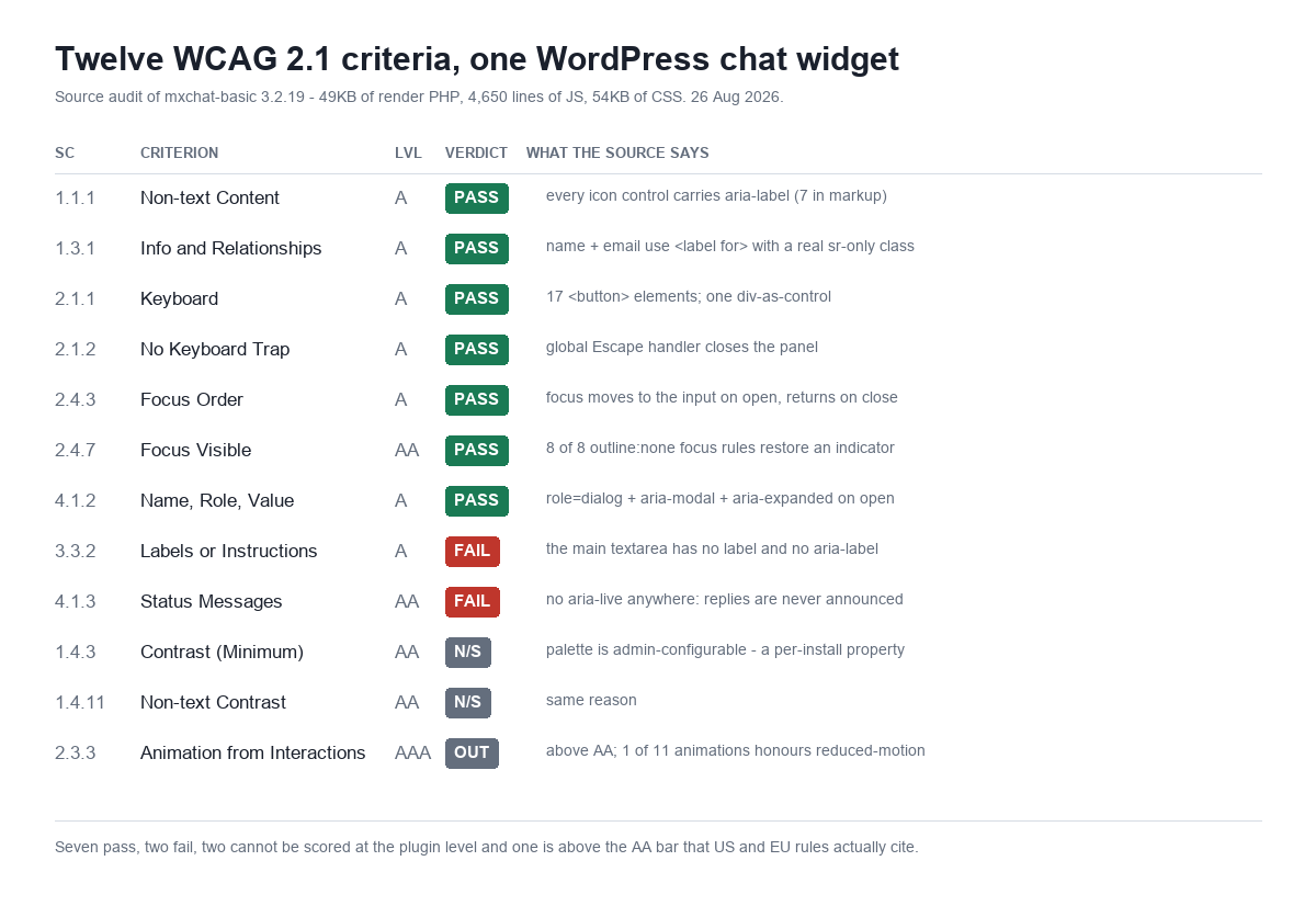
| Criterion | Level | Verdict | Evidence in source |
|---|---|---|---|
| 1.1.1 Non-text Content | A | Pass | 7 aria-label values in markup covering every icon-only control |
| 1.3.1 Info and Relationships | A | Pass | Name and email fields use <label for> with a correctly implemented .sr-only |
| 2.1.1 Keyboard | A | Pass | 17 real <button> elements; only one styled div acting as a control |
| 2.1.2 No Keyboard Trap | A | Pass | Global Escape handler closes any open widget |
| 2.4.3 Focus Order | A | Pass | chatInput.focus() on open; focus returns to the launcher on close |
| 2.4.7 Focus Visible | AA | Pass | 8 of 8 outline:none focus rules restore an alternative indicator |
| 4.1.2 Name, Role, Value | A | Pass | role="dialog" + aria-modal="true" applied on open, removed on close |
| 3.3.2 Labels or Instructions | A | Fail | The primary textarea has no label and no aria-label |
| 4.1.3 Status Messages | AA | Fail | Zero live regions anywhere in markup or script |
| 1.4.3 Contrast (Minimum) | AA | Not scoreable | Palette is admin-configurable — a per-install property |
| 1.4.11 Non-text Contrast | AA | Not scoreable | Same reason |
| 2.3.3 Animation from Interactions | AAA | Above AA | 1 of 11 animations honours prefers-reduced-motion |
Seven passes is genuinely more than I expected going in. Somebody did real accessibility work on this widget: the dialog semantics are correct, the keyboard handling is deliberate, the lead-capture fields have properly associated hidden labels, and the menu even implements arrow-key navigation. That is not accidental.
Which makes the two failures more interesting, not less.
Failure 1: nothing announces the reply
This is the big one, and it is specific to chatbots in a way that generic accessibility advice tends to miss.
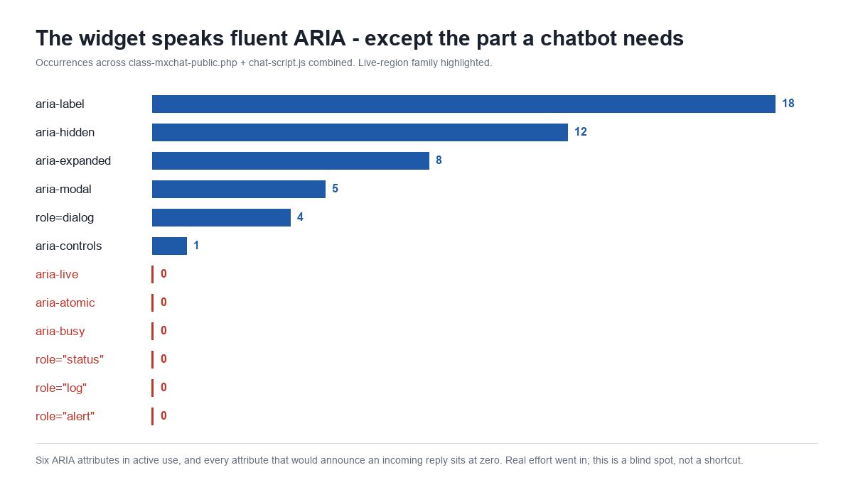
Search the entire front end — the render class and all 4,650 lines of the script — for the attributes that tell a screen reader “something new appeared, say it out loud”:
| Attribute / role | Occurrences in markup | Occurrences in JS |
|---|---|---|
aria-live | 0 | 0 |
aria-atomic | 0 | 0 |
aria-busy | 0 | 0 |
role="status" | 0 | 0 |
role="log" | 0 | 0 |
role="alert" | 0 | 0 |
Every one of them is zero. Meanwhile the same files carry 18 aria-label attributes, 12 aria-hidden, 8 aria-expanded and 5 aria-modal. This is not a widget where nobody thought about ARIA. It is a widget where the entire live-region family was missed.
Here is what that means in practice. The bot’s reply is written into the message container with a plain DOM assignment — messageContent.innerHTML = html. The text lands in the page. Visually it appears, streaming in token by token. To a screen reader, nothing happened at all.
So the experience for a blind user is: type a question, press Enter, and hear silence. There is no announcement that the request was sent, no announcement that the assistant is thinking, and no announcement when the answer arrives. The user has to manually navigate back into the message container and hunt for content that may or may not have finished streaming.
For a chatbot this is close to a total functional failure, even though the widget technically passes seven other criteria. Every other control is labelled beautifully. The one thing the component exists to do — deliver an answer — is delivered silently.
The fix is not large. The message container needs to be a live region, and the streaming needs to not spam it:
<div id="chat-box-1" class="chat-box"
     role="log"
     aria-live="polite"
     aria-atomic="false"
     aria-relevant="additions text">
The nuance is aria-live="polite" rather than assertive (you do not want to interrupt the user mid-sentence), and the streaming behaviour needs care: announcing every token as it arrives produces an unusable stutter. The workable pattern is to mark the bubble aria-busy="true" while tokens stream and flip it to false on completion, so the assistive technology announces the finished message once rather than 400 times.
That detail is why “just add aria-live” is not quite the whole answer, and probably part of why this got missed. Live regions are easy to add and easy to add badly, and a badly-implemented one is worse than none.
Failure 2: the input everyone types into has no name
The second failure is smaller but oddly stark, because of what surrounds it.
Every icon control in this widget has an explicit accessible name. I found More options, Close, Hide Quick Questions, Show Quick Questions, Send message, and Open chat. The optional name and email fields in the lead-capture step each have a real <label for="…"> tied to the input’s ID, hidden with a correctly implemented .sr-only class.
And then the main chat textarea — the single element the entire widget exists to collect input into — has neither. No <label>, no aria-label, no aria-labelledby, in the markup or anywhere in the script. Its only accessible name comes from the placeholder, which on this install reads:
How can I assist?
Two problems with leaning on that. First, it is a prompt, not a label — it describes what the bot will do, not what the user should put in the field. Second, and more concretely: placeholder text disappears the moment someone starts typing. A user with a cognitive disability who tabs away mid-message and comes back has no remaining indication of what the field was for. That is the specific scenario WCAG 3.3.2 exists to prevent, and it is why placeholder-as-label has been discouraged for well over a decade.
This one is a two-line fix and there is no interesting engineering argument against it.
The failure that wasn’t
I want to include this because the process matters as much as the result, and because I nearly published a finding that was not true.
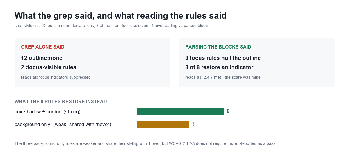
My first pass at the stylesheet was a grep, and it came back looking bad: 12 outline: none declarations against only 2 :focus-visible rules. That is the classic signature of a developer stripping focus rings for aesthetics, and it fails WCAG 2.4.7 outright. I was ready to write it up as failure number three.
Then I parsed the actual rule blocks instead of counting matching lines. Of the 12 outline: none declarations, only 8 are on :focus selectors at all — the rest are on hover and base states, where suppressing an outline does nothing. And of those 8, all 8 set an alternative visible indicator in the same block: box-shadow, border-colour, background, or a combination.
| What the 8 focus rules restore | Count | Assessment |
|---|---|---|
box-shadow and/or border-color | 5 | Strong — clearly distinguishable indicator |
background only | 3 | Weaker, and shares its styling with :hover |
So 2.4.7 is met. The honest caveat is that the three background-only rules are the weak end of “met”: they change nothing but a fill colour, and they are written as a combined :hover, :focus selector, so keyboard focus looks identical to a mouse hover. Under WCAG 2.2 that would run into 2.4.11 Focus Appearance, which sets a minimum size and contrast for the indicator itself. But 2.2 is not what ADA Title II or EN 301 549 currently cite, so under the standard that actually binds, this is a pass — and reporting it as anything else would be inventing a violation to make the post more dramatic.
The generalisable lesson: a substring count is not an audit. Grep told me how many times a string appeared; it could not tell me which selector it belonged to or what else was in the block. The same run produced another example — searching for INP (the Core Web Vitals metric) returned 83 hits across the site’s content, every one of them a false positive from the word “input.” I have run this kind of source audit on our own plugins before, and the pattern repeats: the first instrument finds the candidate, and a second, slower instrument decides whether it is real. This time the second instrument acquitted rather than convicted.
Two criteria no plugin can be scored on
Contrast — 1.4.3 for text, 1.4.11 for UI components — is where plugin-level accessibility claims break down, and it is worth understanding if you are shopping for a chatbot on compliance grounds.
The widget’s colours are not in the stylesheet. They live in mxchat_theme_options and mxchat_theme_color_settings in the WordPress options table, set by whoever configured the site. Bubble colour, text colour, header colour, button colour, background — all admin-configurable.
Which means contrast is a property of your install, not of the plugin. The same version of the same widget can pass 4.5:1 comfortably on one site and fail badly on the next, and no vendor can honestly promise otherwise. Any chat plugin that advertises itself as “WCAG compliant” while offering a colour picker is making a claim it does not control.
The practical consequence: if you have customised your chat widget’s colours, that customisation is an accessibility decision and nobody audited it for you. It takes about ninety seconds to check with any contrast tool.
What to check on your own widget
None of this is specific to one plugin. Whatever chat or chatbot tool you are running, these five checks take a few minutes and cover most of the real-world damage. This is worth doing alongside the broader site-level accessibility tooling most WordPress owners already have in place, since scanners generally do not exercise a widget that has to be opened and interacted with first.
| Check | How | Passing looks like |
|---|---|---|
| Can you open it with a keyboard? | Tab to the launcher, press Enter | Panel opens and focus lands inside it |
| Can you get back out? | Press Escape | Panel closes, focus returns to the launcher — not to the top of the page |
| Is the reply announced? | Inspect the message container for aria-live or role="log" | The attribute is present on the element replies are written into |
| Does the input have a name? | Inspect the text field | A <label for> or aria-label — a placeholder alone is not enough |
| Do your colours pass? | Any contrast checker, on your configured palette | 4.5:1 for message text, 3:1 for buttons and borders |
The third one is the check almost nobody runs, and on the evidence of this audit it is the one most likely to fail. It is also the only item on that list that a general-purpose accessibility scanner will reliably miss, because the failure is not in the static page — it is in what happens after a message arrives.
What happens next here
Both failures are now filed as build work rather than left as a blog post observation. The live region is the priority: role="log" with aria-live="polite" on the message container, plus aria-busy toggling around the streaming window so a 400-token answer is announced once instead of continuously. The textarea label is a two-line change that should ship alongside it.
I would rather publish an audit of our own widget that finds two real failures than a marketing page claiming compliance we have not verified. This is the same reason we published the prompt-injection audit of our own bot and named what it could not defend against. If you are evaluating chatbot plugins, the vendor willing to show you their failing criteria is giving you more useful information than the one with a compliance badge in the footer.
And if you are working through your own compliance timeline, check which regulation actually applies to you before you check the date. The EU AI Act’s chatbot disclosure rules arrived on 2 August 2026 and bind anyone whose bot output reaches EU users — a much wider net than ADA Title II casts, and a deadline that has already passed rather than one still two years out.
Setup details for the widget’s markup and configuration are in the MxChat documentation.


