High-Converting Lead Capture Form Guide
At its most basic, a lead capture form is just a simple form on your website where visitors can enter their contact information. But it's so much more than that. Think of it as the start of a conversation. It's the moment an anonymous visitor raises their hand and says, "Hey, I'm interested in what you have to say."
This simple exchange—their contact details for something valuable you're offering, like a helpful guide or a newsletter subscription—is the first, crucial step in turning a stranger into a potential customer, or what we call a qualified lead.
Your Website's Digital Handshake

Don't just see a lead capture form as a static box on a page. Picture it as your website's friendly receptionist or the firm handshake you offer at a networking event. It’s the initial greeting that breaks the ice, turning a casual browser into someone you can actually talk to. The entire goal is to open a line of communication by gathering key details, even if it's just a name and an email address.
This seemingly small transaction is the foundation of almost all modern digital marketing. Without it, your website visitors are like ghosts—they appear for a moment and then vanish, leaving you no way to follow up, build on their initial interest, or show them how you can solve their problems. The form is the bridge that connects their curiosity to a real business relationship.
Why Every Business Needs Lead Capture
If you're wondering just how important these forms are, look at the money flowing into the market. The lead capture software market was valued at a whopping $2.69 billion in 2024 and is expected to surge to $4.45 billion by 2029. That kind of growth sends a clear message: businesses everywhere are realizing that building a pipeline of new customers starts right here. You can dig deeper into the expanding lead capture market and its future trends.
When done right, a good lead capture form is a workhorse for your business, hitting several critical goals:
- It turns traffic into a real asset. Instead of just anonymous clicks, you get a list of actual people you can contact directly. That list is yours to keep.
- It makes lead nurturing possible. Once you have their email, you can start building trust with helpful content, guiding them closer to a purchase decision without being pushy.
- It helps qualify potential customers. The questions you ask can tell you a lot about a lead's needs and whether they're a good fit for what you sell.
- It feeds your sales funnel. Every single lead you capture is a new opportunity for your sales team, creating a more predictable and scalable path to revenue.
In essence, a lead capture form is more than just a data collection tool; it is the engine of your lead generation strategy. It empowers you to build relationships at scale, turning initial interest into loyal customers.
The Value Exchange: A Core Principle
Let's be honest—people are protective of their personal information. They won't just hand it over. For a visitor to fill out your form, they need a compelling reason. This is what marketers call the value exchange. You have to offer them something genuinely useful in return for their contact details.
This "something of value" can be almost anything, as long as your audience actually wants it. Common examples include:
- Content Offers: Ebooks, whitepapers, checklists, or in-depth guides.
- Webinars and Events: Access to a live training session or a recorded workshop.
- Newsletters: Regular emails packed with industry insights, tips, or company news.
- Free Trials or Demos: A chance to try your product or see your service in action.
- Discounts and Promotions: A special offer or coupon code for new customers.
The trick is to perfectly match the offer to what your target audience is looking for. The more valuable they perceive your offer to be, the more willing they'll be to fill out your form. This simple trade is the spark that ignites the entire customer journey.
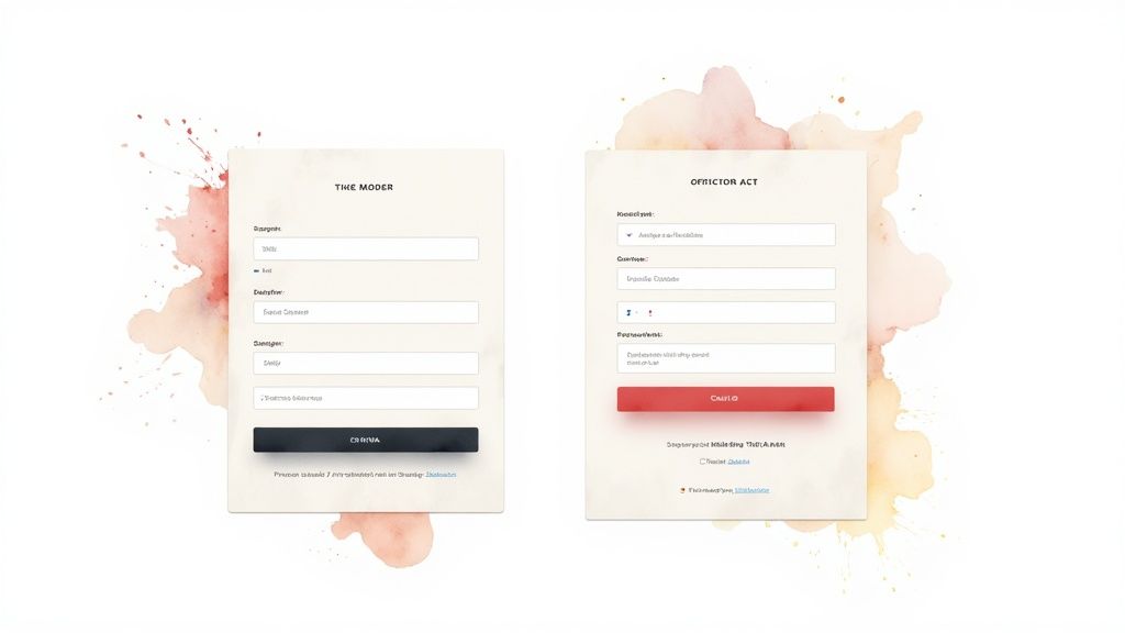
Anatomy of a High-Performing Form
A great lead capture form isn’t just a random set of boxes on a page; it’s a carefully crafted conversation. Every single element, from the headline down to the button text, plays a part in guiding a visitor from casual interest to decisive action. Getting these details wrong is often the difference between a form that converts and one that people scroll right past.
Think of your form as a mini-landing page. It has one job: to present a clear, compelling offer and make it incredibly easy for someone to say "yes." Let's break down the essential pieces that work together to create an experience that feels helpful, not demanding.
The Compelling Headline
Your headline is your first impression. It’s your handshake, your opening line, and it has to immediately answer the visitor’s silent question: "What's in it for me?" A vague title like "Sign Up" or "Contact Us" is a missed opportunity because it focuses on what you want them to do, not on the benefit they will receive.
A powerful headline, on the other hand, shouts the value from the rooftops. It grabs attention and frames the entire interaction as a positive step for the visitor.
- Weak: Subscribe to Our Newsletter
- Strong: Get Weekly Marketing Insights Delivered to Your Inbox
See the difference? One is a chore, the other is a reward.
Strategic and User-Friendly Form Fields
The number of fields in your form is a conversion killer waiting to happen. Every extra box you ask someone to fill out introduces friction and gives them another reason to abandon the process. The golden rule is to ask only for what you absolutely need for the next step.
If you’re signing people up for a newsletter, a single email field is probably enough. If it's a demo for a complex B2B product, then asking for a name, company, and job title makes perfect sense.
Always start by asking for the minimum viable information. The goal is to open the door and start a relationship. You can always gather more details later on, once you've built some trust.
Don't forget the user experience of each field. Use clear, simple labels right above the input box—not inside it. Placeholder text is great for showing an example (like "[email protected]"), but it vanishes as soon as someone starts typing, which can be frustrating. For those wanting full control over these crucial design choices, it's worth learning how to create a form in WordPress without a plugin.
To help visualize how each piece fits, here’s a quick breakdown of what makes a form work.
Key Components of an Effective Lead Capture Form
A breakdown of essential form elements and their specific roles in maximizing conversions.
| Component | Purpose | Best Practice Example |
|---|---|---|
| Headline | To grab attention and state the value proposition clearly. | "Get Your Free SEO Audit in 24 Hours" |
| Form Fields | To collect essential information with minimal friction. | Just two fields: "First Name" and "Work Email." |
| CTA Button | To drive the final action with clear, compelling text. | A bright, contrasting button that says "Send My Audit!" |
| Trust Signals | To reassure users their information is safe and secure. | A small link below the CTA: "We hate spam, too. Read our Privacy Policy." |
By optimizing each of these components, you can significantly improve the performance of your forms.
The Irresistible Call-to-Action (CTA)
Your call-to-action button is the grand finale. This is where the conversion actually happens, so its text and design are critical. Generic CTAs like "Submit" are boring and create uncertainty. What happens when I submit? Where do I go?
A great CTA button is a command that reinforces the value you promised in the headline. Make it specific, action-oriented, and crystal clear about what happens next.
- Bland: Submit
- Better: Download My Free Ebook Now
The design is just as important. Your button needs to pop. Use a color that contrasts with the rest of the form, and make it big enough to be easily tapped on a phone.
Essential Trust Signals
People are protective of their personal information, and for good reason. Trust signals are small visual cues that help ease their anxiety and reassure them that your offer is legitimate and their data is safe.
Here are a few simple but effective trust signals to include:
- Privacy Policy Link: A simple link near the CTA that says "We respect your privacy" shows transparency and builds confidence.
- Social Proof: Mentioning how many others have signed up (e.g., "Join 25,000+ other marketers") uses the power of the crowd to your advantage.
- Security Badges: If you’re collecting any sensitive data, displaying well-known security seals can dramatically reduce hesitation.
By taking the time to dissect and optimize each of these parts, you can transform your lead capture form from a simple data-entry tool into a powerful conversion machine.
Designing Your Form to Maximize Conversions
Sure, the right offer and compelling copy are a huge part of the puzzle. But when it comes down to it, the visual design of your lead capture form is what gets people from "interested" to "submitted." A clunky, confusing form feels like work. It creates friction, and friction kills conversions. On the other hand, a well-designed form feels effortless, guiding a user’s eye straight to that final click.
Good design isn't about being flashy; it's about being clear. Every single element—from the field layout to the color of your button—needs to work in harmony to make filling out the form feel intuitive. This is where user experience isn't just a buzzword; it's what directly leads to more leads.
Choosing the Right Form Layout
How you arrange your form fields has a surprisingly big impact on whether people bother to fill them out. Generally, you're looking at two main options: a single-column or a multi-column layout. It might seem like putting fields side-by-side saves space, but it often sabotages the user experience.
Eye-tracking studies have shown time and again that people complete single-column forms faster. Their eyes follow a simple, uninterrupted path down the page. Multi-column forms force their gaze to jump around in a Z-pattern, which breaks their concentration and can cause them to miss fields entirely.
For the vast majority of lead capture forms, a single-column layout is the gold standard. It just works with how we naturally read online, it’s easier to process, and it looks great on mobile without any extra effort.
Of course, your form doesn't exist in a vacuum. To learn more about the bigger picture and how the form fits into the page itself, check out this great resource on How to Create a High Converting Landing Page.
The Power of Multi-Step Forms
What if you genuinely need a lot of information? A single form with ten fields can look like a mountain to climb, scaring away even interested prospects. This is where the multi-step form shines.
Instead of hitting visitors with everything at once, you break the form into smaller, digestible chunks. The first step might just be their name and email—a super low-commitment request. Once someone has taken that first small step, they're psychologically more invested in finishing the process. It's a classic case of the Zeigarnik effect in action, where our brains are wired to want to complete things we've started.
Here’s why multi-step forms work so well:
- They’re less intimidating. A few fields per page feels way more manageable than one long, scrolling nightmare.
- They keep things organized. You can group related questions, like contact info on step one and project details on step two.
- They boost completion rates. A progress bar showing "Step 1 of 3" gives people a sense of accomplishment and a clear finish line, which keeps them motivated.
Guiding the User with Visual Cues
Beyond the basic structure, you can use subtle design tricks to guide a visitor's attention right where you want it. This is all about using visual hierarchy and a bit of color psychology to make your form not just easy to fill out, but persuasive.
Think of your form's design like a set of signposts for the eye. You need the most important parts—especially that call-to-action button—to be impossible to miss.
- Color Psychology: Use a bright, contrasting color for your CTA button. If your brand colors are mostly blues and grays, a pop of orange or green will instantly draw attention. You want that button to be the most visually interesting thing on the form.
- Visual Hierarchy: Use size and spacing to create a clear order of importance. The headline should be the biggest, the field labels clear but smaller, and the CTA button should feel like the grand finale.
- White Space: Don't be afraid of empty space! Crowding your form fields makes it feel cluttered and overwhelming. Ample white space makes everything easier to read and gives the form a clean, professional feel.
When you nail this combination of a clean layout and smart visual cues, the entire experience becomes seamless. This is true whether you’re building a form from scratch or using integrated tools. For example, if you're on WordPress, you can learn how to master the Constant Contact WordPress plugin for high-converting landing pages and apply these same design principles.
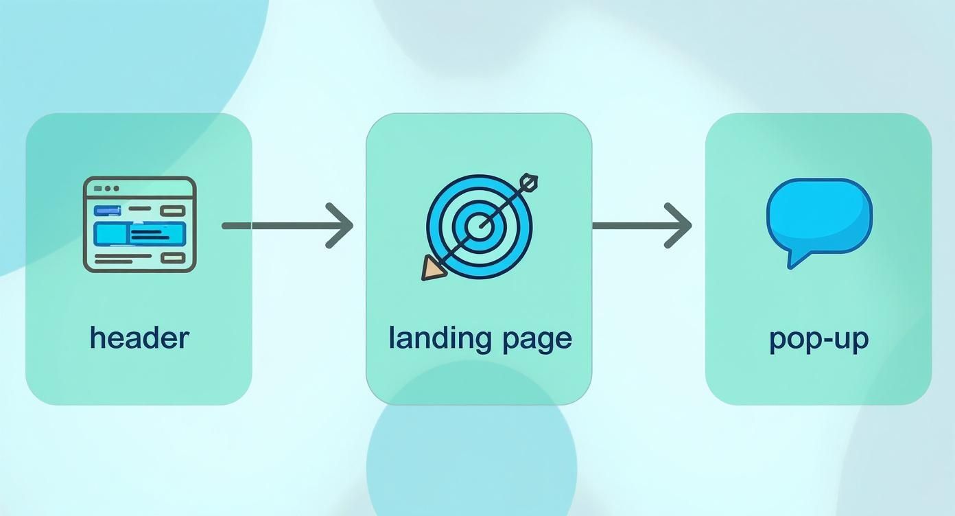
Placing Your Form for Maximum Visibility
You can craft the most beautiful, compelling lead capture form in the world, but if no one sees it, it's just wasted effort. Think of it like a brick-and-mortar store—location is everything. Placing your form in the right digital real estate means you catch visitors when they're most interested, which is the key to turning a casual browser into a genuine lead.
Your website isn't just one big space; it's more like a landscape with different zones. Someone reading a blog post is in a different frame of mind than someone on your pricing page. A smart placement strategy recognizes this, putting your forms where they feel helpful and timely, not like a pushy salesperson.
High-Traffic Intersections on Your Website
Some spots on a website are simply natural hotspots for visitor attention. Putting your lead capture form in these areas is like setting up a booth on the busiest street corner in town. You get more opportunities just by being where the action is.
Here are a few prime locations to consider:
- Website Header or Navigation Bar: This is the most consistent real estate on your site, visible on almost every single page. A clear, eye-catching button like "Request a Demo" or "Get a Free Quote" keeps your primary call-to-action front and center.
- Homepage (Above the Fold): Your homepage is your first impression. Placing a lead form right at the top ensures every visitor sees your main offer the moment they arrive. Don't make them hunt for it.
- Sidebar of Your Blog: If someone is deep into one of your articles, they're already engaged. A relevant offer in the sidebar—like a newsletter subscription or a downloadable checklist—is the perfect next step for them.
Contextual Placements for Higher Quality Leads
While high-traffic areas are fantastic for sheer volume, sometimes you want quality over quantity. Placing forms in very specific, relevant spots can bring in leads who are far more qualified. This is all about targeting users at the peak of their interest. After all, businesses generate an average of 1,877 new leads monthly, but the real win is attracting people who are actually a good fit.
Placing a form is about timing and relevance. You want to present your offer at the exact moment a visitor is thinking, "This is exactly what I need." That’s when the magic happens.
Smart Pop-Ups and Exit-Intent Overlays
Pop-ups have a bit of a bad rap, but when they're used thoughtfully, they work incredibly well. The trick is to avoid ambushing visitors the second they land on your page. Instead, use smart triggers based on their behavior.
- Timed Pop-Ups: Have the form appear after a visitor has been on a page for a set amount of time, say, 30 seconds. This shows they're actually reading and not just bouncing.
- Scroll-Triggered Pop-Ups: Trigger the form only after a user has scrolled 75% of the way down a page. This is a strong signal that they found your content valuable.
- Exit-Intent Technology: This one is a real game-changer. It detects when a visitor’s cursor moves towards the back button or to close the tab and presents a last-ditch offer, like a special discount or a helpful freebie.
Each of these placements has a different job, from casting a wide net to targeting highly engaged prospects. If you're using modern tools like MxChat, embedding these forms can be even more powerful and dynamic. You can learn how to boost conversions with chat funnels and MxChat, turning a static form into an interactive conversation. For the nuts and bolts of getting your forms live, guides that explain how to add a contact form to any website can walk you through the technical steps.
How to Build and Optimize Your Form with MxChat
Alright, let's move from theory to action. This is where you see the real results. Building a high-performance lead capture form doesn't have to be some complex coding nightmare. With a tool like MxChat, the whole thing becomes a pretty straightforward and intuitive way to connect with your audience.
Instead of just slapping a static form on your site, MxChat helps you turn lead capture into a genuine conversation. This is a huge shift, but it's one that meets people where they are today. It makes sharing information feel more natural and a whole lot less like a chore. The real goal here is to make the entire experience feel smooth, from their first click to the moment they hit "submit."
Starting Your Build in MxChat
The first stop is MxChat’s no-code form builder. It’s designed to be simple. You can drag and drop different fields, change up the labels, and set the logic without touching a single line of code.
You can start with the basics like "Name" and "Email," but then you can layer in more advanced options that actually help qualify your leads. Think about including multiple-choice questions about their biggest pain points or even their budget range. Just like that, your form goes from a simple contact collector to a powerful tool for gathering real intel.
The secret to building a form that actually works is to think about the user's journey. With MxChat, you can guide them through the process conversationally, which cuts down on friction and makes them much more willing to give you their info.
This screenshot gives you a peek at the clean, user-friendly interface you'll be working with inside MxChat.
As you can see, the dashboard is clean and organized, making it easy to jump in and start creating, managing, and tweaking your forms and chatbots without a massive learning curve.
Optimizing for Higher Conversion Rates
Look, building the form is just the first step. Continuous optimization is what really separates the good forms from the great ones. MxChat comes packed with features designed specifically to boost your submission rates through smarter design and data-backed testing.
One of the most effective tricks in the book is using smart fields. These can pre-fill information for people who've visited before or even change dynamically based on their earlier answers. It creates a personalized feel and, by cutting down on how much they have to type, you can dramatically reduce form abandonment.
Another powerful technique is breaking up your form. A long form is intimidating. But if you split it into smaller, bite-sized chunks—what we call a multi-step form—it feels way less daunting. It’s not just a theory. One leading B2B software company saw a 35% increase in form conversions after they switched to a multi-step format. In another case, an e-commerce brand that used analytics to trim down its form fields saw a 25% reduction in abandonment rates. These aren't just numbers; they show that small, smart changes can deliver huge wins.
Running A/B Tests for Continuous Improvement
Never, ever assume your first draft of a form is the best one. It rarely is. The most successful marketers I know are constantly testing, learning, and iterating. MxChat makes this easy with built-in A/B testing, so you can experiment with all the different pieces of your form.
Not sure where to start? Here are a few simple A/B tests you can run to start refining your form:
- CTA Button Text: Test out different calls to action. Does "Get Your Free Guide" pull in more clicks than "Download Now"?
- Number of Fields: Pit a version with three fields against one with five. Does the shorter form actually lead to a big jump in submissions?
- Headline Copy: Try out value-focused headlines. Which one wins: "Sign Up for Our Newsletter" or "Get Expert Tips in Your Inbox Weekly"?
- Form Placement: Test an embedded form against a pop-up that appears after 10 seconds. Which one generates more qualified leads?
By running tests like these, you stop guessing and start using real data. You'll see exactly what connects with your audience and be able to make informed decisions that directly grow your lead list. The insights you get from A/B testing will help you fine-tune every single part of your form for peak performance. You can even take it a step further by exploring our guide on how to use in-chat forms for lead capture to add another powerful tool to your strategy.
Common Questions About Lead Capture Forms
Let's be honest, when you're trying to get lead capture forms just right, a lot of questions pop up. You're not alone. Here are answers to some of the most common ones we hear, designed to help you build and optimize your forms with confidence.
How Many Fields Should My Form Have?
Ah, the classic question. The simple answer is always: as few as you absolutely need. Every single field you add is another little hurdle for your visitor, and hurdles can kill conversion rates.
The right number really depends on what you're offering. If it’s something low-commitment, like a newsletter subscription, just ask for an email. That's it. But for a higher-value offer, like a free consultation or a product demo, asking for a name, company, and phone number makes sense. The lead is more invested, and that extra info helps you qualify them.
Think of it this way: the amount of information you ask for should match the value you're giving back. Don't demand a phone number for a simple PDF download. Start small, build trust, and you can always gather more details down the road.
What's the Best Call-to-Action Text to Use?
Your Call-to-Action (CTA) button needs to be the clearest, most compelling part of your form. Forget generic, lazy words like "Submit" or "Enter." They're uninspiring and don't tell anyone what they're actually getting.
Instead, use action-oriented language that highlights the value. Be specific and make it sound like a great deal.
Instead of: Submit
Try: Get My Free Ebook
Instead of: Sign Up
Try: Join 20,000+ Marketers
The best CTAs complete the sentence, "I want to…" A user sees your form and thinks, "I want to Download My Free Template." Clicking the button suddenly feels like the natural next step.
How Do I Make Sure My Form Is GDPR Compliant?
In today's world, data privacy isn't optional. Getting GDPR compliance right is critical, especially if you have visitors from the EU. Messing this up can lead to massive fines and, just as bad, a total loss of your audience's trust.
Here’s how to make your lead capture form compliant:
- Get Clear Consent: You need an unchecked checkbox where users have to actively agree to your terms. Pre-checked boxes are a no-go. Use simple language like, "I agree to receive marketing communications."
- Link to Your Privacy Policy: Always include a visible link to your privacy policy. This document should clearly explain what data you collect, why you're collecting it, and how people can get it removed.
- Collect Only What You Need: This is called "data minimization." Only ask for the information you need for the specific purpose you stated. It’s a core principle of GDPR and just happens to be a conversion best practice, too.
Should I Use a Single-Step or Multi-Step Form?
This really comes down to how much information you need to collect.
Single-Step Forms: These are your best friend for simple requests—think 2-4 fields max. They're fast, direct, and perfect for things like newsletter signups or basic content downloads.
Multi-Step Forms: When you need more detailed information, break it up. A long, intimidating form is a conversion killer. By splitting it into smaller, manageable chunks, you reduce that "Ugh, this is too much work" feeling. Adding a progress bar also works wonders to keep people motivated and moving forward.
There's no single right answer for everyone. The only way to know for sure what your audience prefers is to test it. Run a simple A/B test and let the data tell you whether a single or multi-step form brings in more quality leads for your offer.
Ready to stop guessing and start building forms that actually convert? With MxChat, you can create smart, conversational lead capture forms that engage your visitors and fill your pipeline—all without touching a line of code.